I received a very kind compliment recently, my paintings remind them of Dan Burt’s paintings. I’d never heard of Dan Burt but, man, I know his work now!! Totally amazing – PLUS totally incredible colour!!
This led me to think about the misconception about watercolour – that it’s wishy-washy, subdued, delicate and painted by Victorian ladies. YES 150 YEARS AGO!! We’re now in the 21st century and along with my peers, watercolours are now a contemporary medium painted in many styles. I’m known for my strong colour – that’s how I see the world, that how I want the world to be. I love the challenge of watercolour – it’s not for the faint of heart! If you’re happy to paint on the edge of your seat from time-to-time, watercolour is the best medium! Skydiving is not the only means to get an adrenaline rush! Many years ago I made a deliberate decision to paint stronger vibrant colour. It was a natural step for me, as I’ve always put unusual colours together. As I embarked on my professional artist’s journey, it seemed that, partly due to the lack of appreciation for watercolours back then, my work needed stronger colour to stand amongst the strong colours of opaque medium. A tiny 5ml tube of watercolour is confusing, how far will that tiny 5ml tube of paint go? Quite far if you are painting small once or twice a week, not far enough if you paint big every day. Buy artist’s quality paint and the little 5ml tube will go even further. This is going to sound strange but, buy 100% cotton rag paper and you will notice good quality paint goes even further and is more vibrant. A good practice for the watercolour painter is to start with a tiny amount of paint pigment and add water to make a nice puddle to paint with. Next build up some stronger colour with more paint and less water, then even more paint and much less water = DO NOT ADD MORE WATER, do not “clean” your brush between washes. Please note creating a large area wash is all about starting off with lots of water and then reducing the amount of water while you are increasing the amount of pigment. By dipping into your water pot too often, your brush’s water ratio will be out of whack and in danger of diluting your wash and creating blooms where you don’t want them. This practice will grow your understanding of water-to-paint-to-brush-to-paper ratios. Further the watercolour painter should be mindful of the same water-to-pigment ratio throughout the whole painting. Even with a good command of values, a watercolour can look insipid without a good variety of pigment strength. Another weapon in your armoury for vibrant colour is to remind yourself to lay down your colour confidently and then DON’T TOUCH IT! Hands in your pockets – walk away!! Continual fussing and excessive brushstrokes lead to dull colour. When glazing colour or layering colour, to add richness and vibrancy, consider using the same colours/pigments ie if you are painting a lemon, then paint the same colour in both washes. For example if I underpaint and let blue flow through my lemon and then the second pass (glaze) is yellow, my lemon is unlikely to be a bright saturate colour. I’m not saying it’s wrong, I’m saying think about your colours and how you want to use them, what you want to achieve. Add a good glob of fresh artist’s quality paint to your palette every week, let it set up overnight. Before you begin your painting session, give it a spritz of water and you’re good to go! Continual scrubbing at dry paint (aka bird poop = poor quality paint) will distract you from creating. It’s imperative to use the right brush for the job at hand. A small brush will not help you to lay down a sky wash – it won’t hold enough water to form a bead, your previous marks will dry too soon and you’ll end up with brush marks and blooms. For beginners, too big a brush with a good point and fat belly will do a good job for you. Practice with it and learn how to use it, with a good brush it is possible to paint a whole painting, start-to-finish, with just this one brush. ciao cari pittori let me know what you think in the comments below!! 
10 Comments
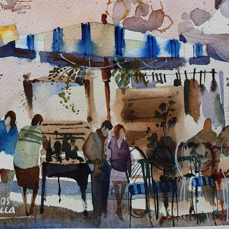
 "Lunch for Pepe" "Lunch for Pepe"
Although most paintings come to a natural conclusion, we all ask ourselves "is my painting finished yet?"
I have heard it said that "Your painting is finished before you have" meaning we should stop painting, stop fiddling!! Further, by spending more time planning your painting and drawing "finished" value studies and sketches and then painting to those sketches and plans, you will find that "finishing" just seems to happen - your works will come to a natural conclusion. On occasion, however, there will still be a work that takes longer to complete; it is 99.9% done but what is that final stroke? How do I decide if my work is finished? Remember, sometimes we need time to make all these decisions, your painting does not have to be finished right now! These are some of the questions I ask myself when I am hedging around: Unity: does the artwork looked unified? In other words, does every element link to every other element in the painting? For example an orange pumpkin may not work in a painting with a car as the main subject. But it might if the car was parked in a pumpkin field. Does the artwork seem complete? is there anything that jumps out at it you? Contrast: is there enough contrast? Is the darkest dark placed next to the lightest light in the focal area? What other contrasts are relevant to this piece of art? are there enough soft edges? are there enough hard edges in the focal area? Dominance: is there one shape, mark or colour that is dominant over all the others? What additional shapes, marks or colours are required to reinforce the dominance? Repetition: are there any colours, shapes or marks that seem isolated? Where could they be repeated to provide greater balance? Harmony: does the artwork have a sense of harmony? Linked to unity, harmony provides a sense of equilibrium. For example harmony can be achieved by using a limited palette. is the style of all the marks and shapes similar? Eg, is there a shape that is painted based on your sense of realism but the rest of painting includes mostly abstracted shapes? Ie, do all your shapes have similar attributes? Balance: is there good use of BIG, medium and small. Does the overall composition design work well? Are all opposing forces balanced? does it feel balanced? does your eye keep moving to a spot of nothing in the painting and then stop? Gradation: a sequence of blending from one extreme to another providing harmony and contrast. For example, the sequence of steps between the lightest light and the darkest dark is as important as the juxtaposition of contrasts. If that last wee gem is not answering itself quickly enough or your eye doesn’t pull directly to your focal point, put the painting away for a couple of weeks and then cast fresh eyes over it - the answer will very likely present itself to you. Sometimes, I leave a work in my studio or living room so i can see it as I'm moving about and seeing the same issue over and over again!! do feel free to comment or ask a question! Happy Painting!! 
Watercolour is often viewed as if it occupies its own little vacuum.
I remember a well-known artist friend collecting his paintings after a show: “I’m here to collect my paintings” “What do you mean?” “I’m here to collect my paintings” “Oh you mean your watercolours” As if watercolours are not paintings and are separate, not even a category – not art, nor paintings – urk! However, oddly enough, painted with a brush (in most cases!). It’s a common weird nonsensical bit of claptrap. Mamma mia!! Sometimes it feels like watercolour painters are set up for this. A popular art show I used to enter had a “professional” category for Oils/Acrylics. Does this make me not a professional artist? For a while I entered the professional category just to state my case and annoy them, really it’s just ignorance (mine or theirs??). I was particularly miffed to discover that my well-known watercolour artist Uncle started that show in 1954 (or thereabouts)!! Instead of being hailed the Queen (lol), my bags packed and cast into the snow!! My point is, no matter your medium (pastel, music, poetry, blogging, sculpture, watercolour or oils) art is art and all need the same kind of thought and emotive language – darkness brings the light, grey accentuates chromatic colour, dominance emphasises an accent, indications are mysterious. All art forms follow a set of guidelines (rules to be broken). Visual art is no different, we follow design principles created to help novice (and not-so novice) artists use pictorial or visual language to tell a story via visual impact. In particular, today, I’m talking about colour charging. My 2 ideas for you today are:
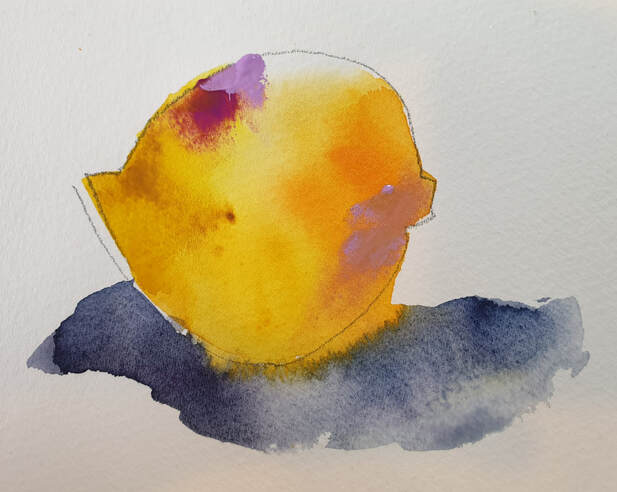
The watercolour painter has to be patient (I’ll just leave now!) and focussed and wait for the water-to-paint-to-brush-to-paper ratio to be just right. Mostly novice watercolour painters are taught to “let it dry” which is the biggest mistake ever. I say this because this damp time is the fun-zone of watercolour and you are missing out my friend! Boo!! Partly the issue lies in our process and planning and partly our lack of brush miles and then sometimes our courage flies out the window. But this FUN-ZONE is where the magic happens, what you and I have to do is be present and pay attention to what we’re doing and what’s happening on the paper. This level of focus is where you’ll learn the poetry of watercolour – choose your focal point and play with it. How fun would it be to paint a lemon with a dab of orange, a bigger dab of a cooler yellow and a master stoke of cool pink for a shadow? ciao belli pitturi!!
|
AuthorPaintBox Tips, secrets, random thoughts, 
Poetry in watercolour is made in the freedom of the here and now. Amanda Brett Inspiration exists, but it has to find you working - Pablo Picasso 
There are no mistakes in watercolour, just some extra surprises!! Categories
All
What my readers and viewers have to say
Your emails are so informative! I must confess I've watched a couple of your demos from beginning to end, and it makes me want to watercolor!!! I've only ever painted with oil or acrylics and haven't know how to begin with WC. Your content is excellent!
Susan VN Hi Amanda
Thank you for your tips. They inspired me to practise and I realised I haven’t been loading the brush properly. I learnt about adding more paint, and not water, to washes. In today’s tips I like the idea of painting with purpose. Your tips are very helpful. I very much appreciate receiving them. Elizabeth Hi Amanda I enjoyed your post and generous tips. Looked up Dan Burt I begin to see that you can colour any subject to give it pizazz so long as the tone and form is correct Certainly adding value now to my attempts Thanks heaps Annie
Yes very wise words. Agree with not fussing and agree with comments about good quality paint. Well written and inspirational as always. Cheers Janet xxxx Archives
July 2023
Copyright © 2022 All images and text on Amanda's blog and website are the the legal property of Amanda Brett and may not be reproduced without express permission from Amanda Brett or her authorised agent. Thank you for respecting her art and the livelihood of all artists.
|