StudioThis page is dedicated to watercolour art lovers who want to know a little bit more about my creative process, drawings, thinking and why I do what I do.
|

|

|
|
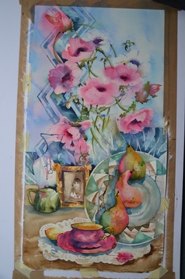
Cakes on a Plate
I just realised I haven't added a new painting to this page for a while!! this is Cakes on a Plate, a corona virus staycation painting that got a little bit out of control!! I have to say HOWEVER, it was a lot of fun to come up with these ideas and paint them! it's not quite finished - often I stop before I've finished, do a little thinking, start another painting and then come back to it in a week or two. Sometimes I need to check some spontaneous elements and make sure I still like them. The reason for this painting? I was (and have to admit I still am) a little low during this lockdown, so it really is a painting to take my mind off the world's woes. so here's what I want you to see in this painting: firstly, there's little of anything that is straight - I can't stand a straight line (having said that, a painting on my wall is crooked ... fixed - yay!!) Nor do I like anything centered, my goal is to avoid symmetry. There's usually a 'buckle or bow' and when I draw in preparation for painting, there is often a gap which will remind me to let paint bleed into wrong places - another yay! Next, every inch in this painting is different from every other inch - a BIG YAY!! it would be easy to paint the walls of the building with same colour and value but how boring world that be? there's a lovely patch of turquoisy green above the red umbrella and in the green striped awning I've used some the red from the umbrella as the shadow violet. when I notice the big backrun around the top right window, I just about had a hissy fit (watercolour does things behind your back!!) but the only solution was to leave it and use it. Now that I look at that section, it does seem to need a wee splash of turquoise - add to my list. I'm supremely happy with my drain pipes and shadows! the bumpiness of the "straight" pipes indicates the texture and bumpiness of the wall. I needed something new to paint inside the cafe & I suddenly remembered ristorante il Cuore in Lucca, a beautiful Liberty style restaurant which has amazing array of torte on display in a huge glass cabinet - PLUS gorgeous crystal chandeliers (lighting up the hall, I love Charley Pride!). There also huge bottles of grappa in every flavour imaginable!! I can't wait to take Dennis there - he'll love it!! Amazingly, il cameriere recognized my accent, I'll swear he's the only person who hasn't ask me if I'm British, American or Australian! To add to this need for something new, I remembered my dear painting friend, Sue Waugh from many years ago, gave me a tiny painting of fruit in a compote dish which inspired my cake plates. 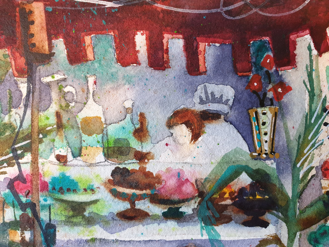
|

|
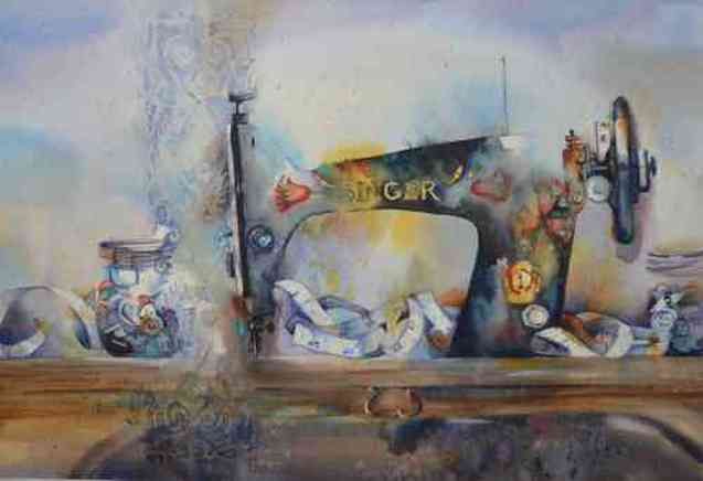
Singer and Stripes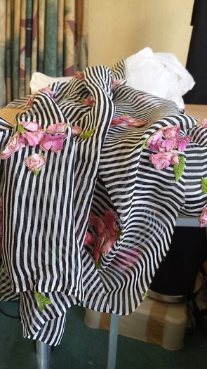
|
Another Singer. I've just fallen in love with them. But it's made me realise how much i love fabric and textures. Some years ago I visited a beautiful fabric store in Parnell and saw this totally amazing black and white striped fabric with appliqued pink flowers - I fell madly in love and just had to have it!!
The inspiration for this singer, isn't it gorgeous? I just love the pink flowers with the beautiful lime green embroidered leaves - totally beautiful!! 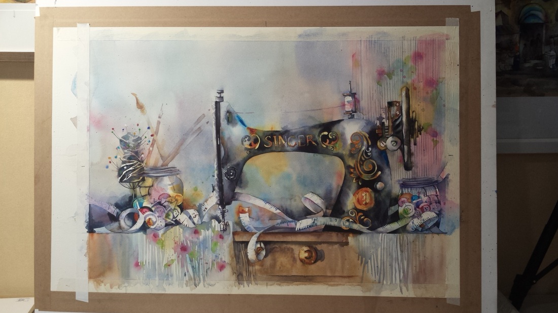
|
|
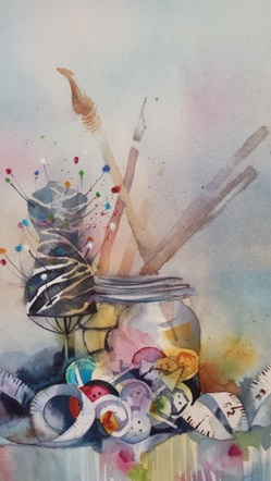
It's really all about building up values and colours. I start my buttons with just a wet in wet wash, dropping in anything and everything ensuring some white paper remains untouched for white buttons or to adjust as needed. I then start negative painting, ie, painting background shapes that pull the foreground shapes into focus. i love negative painting, it really is a keystone skill for watercolour painting.
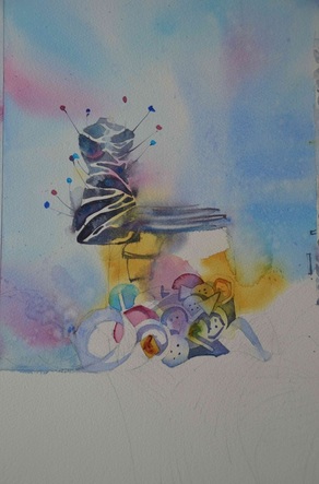
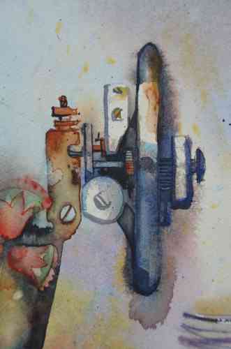
my zebra fabric mannequin pincushion was so much fun and, as usual, i practised many of the shapes in this painting while i was researching shapes and colours. I'm particulary proud of the pattern for the front of the machine. I considered painting it free-hand and many of my practice brush marks were very successful but I decided to draw it first as i wanted it to really represent the sad state some of these machines are in now with the paint rubbed off and tarnished. Many of these machines are well over 100 years old. I'm super happy with my cotton reel and pink thread. I really enjoy drawing and painting in a geometric style. A circle's not a circle, it more like a squared off egg shape. I also masked the medallion and tension screw (thingy) with masking tape so i could be freer with my brushstrokes. Availability: FOR SALE |
Anemones and
|
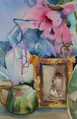
i had tremendous fun (and some angst I have to admit) using my new bamboo pen in the wet and wet of the glass carafe pattern and outline and also in the frame pattern.
|
NOT FOR SALE
SPECIFICATIONS: Fabriano Artistico CP 300gsm 100% cotton rag Size: 700mm x 300mm, unframed © 2014 Amanda Brett, all rights reserved |
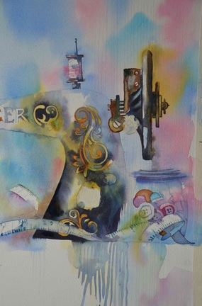
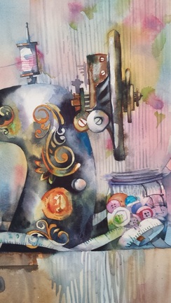
Singer
|
a labour of love, I worked on this painting from concept to completion for about 6 months. I'm absolutely thrilled with the result and obviously the buyer was as well!
I fluffed about with it for so long getting the composition right. I was awed by the beautiful pattern on the front 'plate' of the machine but didn't want to paint it from that angle. so I painted the pattern as a transparent layer coming from behind the machine colliding with the glass jar of buttons, in and out, is it there or is it not there, where does the glass jar begin? where does it end? I had a whale of a time painting the buttons in the glass jars. it was very hard to stop, so i continued on a scrap piece of paper!! I started them by just dropping in colour and then painting the negative buttons behind the front ones, trying to vary the colours, sizes and shapes. i even managed a toggle button!! thrilled with my tape measure as well, lucky i had one handy to flick out onto the table to look at and think about!! it was really all about the value contrast. to remind myself where i needed to leave white paper, i scribbled a light pencil mark. when i completed the painting I rubbed them out ... it sort of looked empty without them so scribbled them back in!! lol!! SPECIFICATIONS: Fabriano Artistico CP 300gsm 100% cotton rag Size: 650mm x 450mm, unframed © 2014 Amanda Brett, all rights reserved |
|
Availability: SOLD - subscribe for more paintings in this series
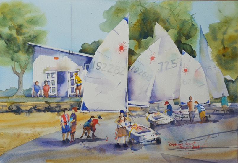
Demonstration : Clipboard Queen
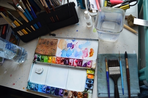
My lovely metal palette, clean for the minute. My favourite brushes are my 2 inch petit gris pur and my rigger, a bit of a contrast but i really could not do without either of them. You can also see one of my new Princeton Neptune brushes. For synthetic brushes they are beautifully soft and hold lots of water, perfect for watercolour!!
My palette (colours) for Clipboard Qeeen are all Winsor and Newton artist quality paints:
Winsor Blue (red shade)
quinacridone gold
alizarin crimson
french ultramarine
burnt sienna
raw sienna
for details and shots of colour:
Manganese blue, cadmium yellow and cadmium red
My palette (colours) for Clipboard Qeeen are all Winsor and Newton artist quality paints:
Winsor Blue (red shade)
quinacridone gold
alizarin crimson
french ultramarine
burnt sienna
raw sienna
for details and shots of colour:
Manganese blue, cadmium yellow and cadmium red
|
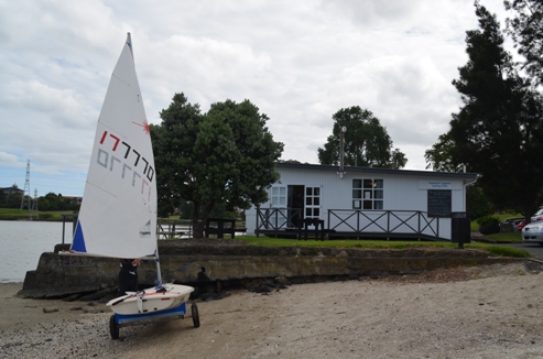
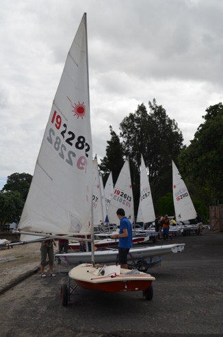
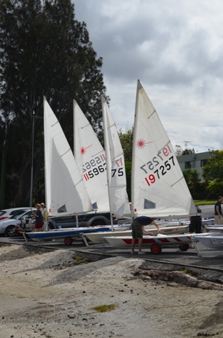
I never try to get the perfect photos, i'm only after reference material, the shapes and shadows are my targets. To get the exact right photo, one could not possibly have people in them, they never do as you expect, i would be waiting around forever!! So my preference is pastiche painting, a little from here and a little from there and some from my imagination. In total I used 8 photos.
|
|

1. one of many drawings and designs, double the size of a credit card, this is about as big as i ever draw. The end result is slightly different, i added in some skaters. In another version i painted I had a couple of skaters but was unhappy with the painting, irretrievable unfortunately, so the skaters made it to Clipboard Queen.
|
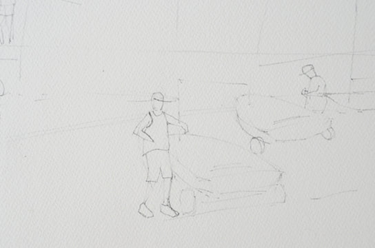
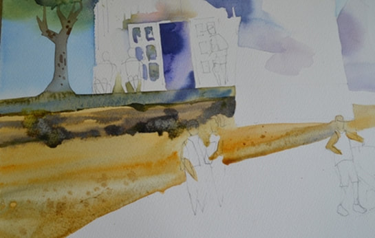
2. I draw only a quick light map on my watercolour paper. my goal is no more than 5 minutes spent on the drawing. Loose and rough with the drawing is best, i work hard not to get caught up in details! |
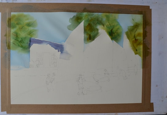
3. First wash, i dropped in water for the sky and trees, then i dropped in a light wash of winsor blue and let it settle. Less water, I head back into my palette for quinacridone gold to mix with winsor blue for a luscious NZ tree green. looks like i dropped in some burnt sienna too. Using my rigger i picked up some stronger pigment for some branches and also scratched a few in with a finger nail. i let these colours run into the shadow of the eaves and then dropped in blue-purples with French Ultramarine and Alizarin Crimson. and also let that run into a sail. Although my paper is stretched, you can see some buckles because the stretching tape has lifted, not enough glue - gggrrrhhh!!
|
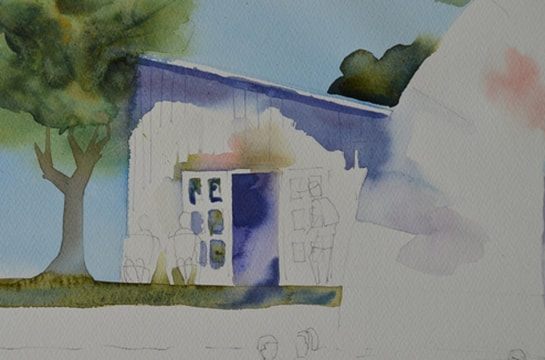
4. i decided the sails might need some more definition so i added a dark tree for contrast and also softened some of the edge. then i added a light colour shadow above the doorway dropping in some cadmium red, a bit of the tree green and some raw sienna. I used French Ultramarine for the dark doorway plus some shadows on the glass panels. I've also softened some of the edges of the shadow of the eaves and, just as it started to dry, i added some vertical shadow lines with my rigger.
|
5. I loaded my brush with a lovely watery mix of earth colours for the rock wall and the sand; raw sienna and burnt sienna are perfect for creating great textures. Pick up more paint and slap that in, then pick up another colour and slap that in, let them run together, drop some clean water in too. I mixed french ultramarine with burnt sienna to get the dark mix for the shadows under the rocks. don't be worried about the colours running, try not to let yourself clean it up - MESS IS GOOD!!
|
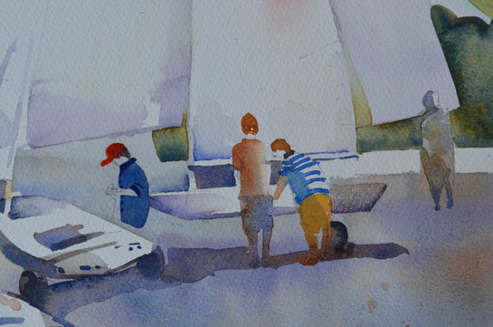
6. some more peple doing their thing organising their boats. what i want you to see here is I painted the people and before they were dry i ran a shadow underneath them catching their feet in the dark. the further away the people are the less detail, these ones are waiting to dry before more detail is added.
|
7. looking at my protagonist, i pretty much painted her all in one go and let the colours of her shirt run into the colour of her shorts and her legs - no worries. she ended up with dark legs, i think of them as wetsuit leggings!!
|
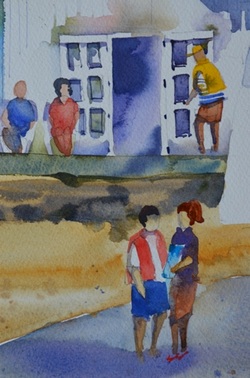
8. I've added some shadows and detail decorations once they were dry. Note the two sitting nanas in the background, pretty much no detail apart from shadows behind them to model their shapes, again very happy to let the paint run.
|
|
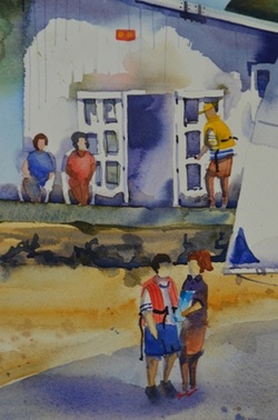
and here is the final painting. I've achieved my goal of a bright sunny day with lots of people, the sails going in every direction, none are the same, looks like a busy day!!
I'm really pleased with my people, they're all different shapes and there's definitely lots of action!! AVAILABILITY: FOR SALE contact Amanda |