I'm still in my self-imposed "lockdown" with my continuing knee problem, It's a lot better but not better enough .. thwarted by my feeble attempts to "keep calm and carry on".
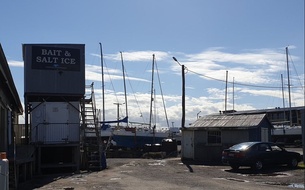
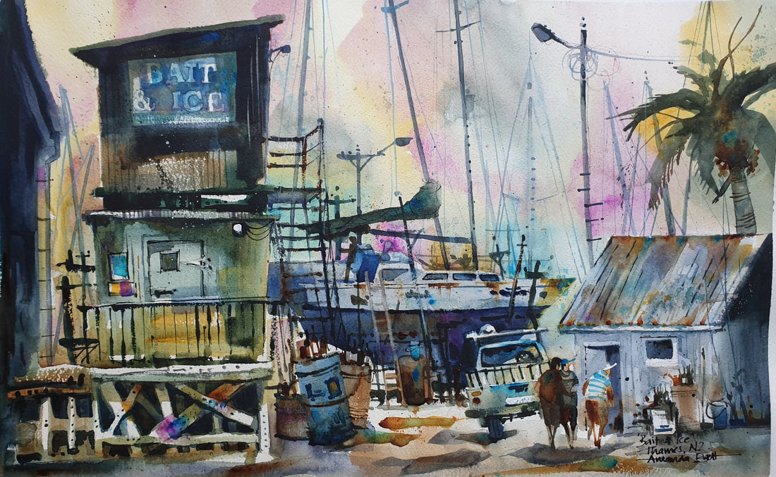
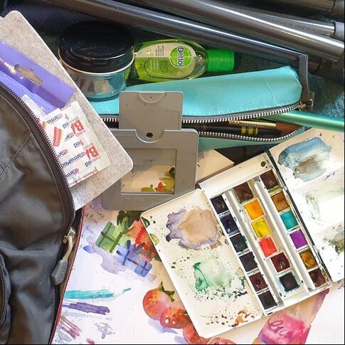
Something that’s really bugging me is my studio clear-out/tidy up/re-shuffle/reorganise started before Christmas. It was a good idea at the time but now I have 2 piles on the floor that are attempting to morph into 3 and I can’t get down there to do much about it. It’s making me crazy! PLUS while I’m nursing my poor wee ginocchio Dennis has now gone back to work, Amy’s back to work and there’s no-one here to entertain me!! YIKES!! So now I find myself in this temporary situation of cabin fever - I'm desperate to get out and paint/sketch, so I've made myself a new plan for my coming escapades. in a feeble attempt to get back to normal, i went for a walk with Amy and the dog. I trailed far behind them, it was so nice to be out and hearing the birds and children playing, families and their picnics but, I have to say, I paid for it the next day ... mamma mia!! It reminded me how dependent I am on my walking, it's my chief thinking time, my meditation and quiet time that allows my thoughts and ideas to run and play out. Another purpose for me is exploration, this is when I see things that inspire me, a fleeting light, shapes interlocking and overlapping, colours or some other interesting and diverting sights. To get out of the house, I've been for a few outings in the car (bicycle is a no-go atm) to scope out some sketching locations but of course, even here in Auckland it's almost impossible to park close enough. So I've decided to go to cafes again, they have to be in the right place, scenic and comfy. There are so many ways to enjoy sketching out, for me, its a totally absorbing experience. Although I love my little value thumbnail sketches, I learn a lot about a scene using this process, I feel the need to change things up a little, expand my sketching and bring more of it into my life. So!! I bought a new sketchbook and made a sketch kit that's always with me. My new sketchbook has a soft cover, so a little lighter than a hard cover but I found an old light but rigid clipboard. My backpack is pretty old, so old it doesn't have a smart phone size pocket - urk! It has a great "book" pocket but without an easy small pocket, pretty much everything falls to the bottom. In my bag I also have a wee first-aid kit, a small professional pan-set, tramper's collapsible water cup, pencil case and a few other weird sketch tools to fun things up a bit! In my pencil case, I have my standard soft pencils, a sharpener and eraser, tombow value brushpens, general’s sketching pencil, small view finder, calligraphy sketch pen, pastel and watercolour pencil, travel brush, small flat brush, water spritzer. To protect pencil tips and brush points, I always place them in the case in the same direction and then “up” in my bag. In Sketch class last week, Mary said “I can’t see enough detail, I’m too far away”. I agree, I need to see exactly what goes on, this helps me to build my story. Go for a walk to understand the lay of the land, what makes this place tick? How do those elements look close up? Always have your camera charged and set to hi-resolution and use a view finder to isolate your scene and cut out the overwhelming and extraneous, then you can just focus on what you want today. have fun!! ciao Amanda
4 Comments
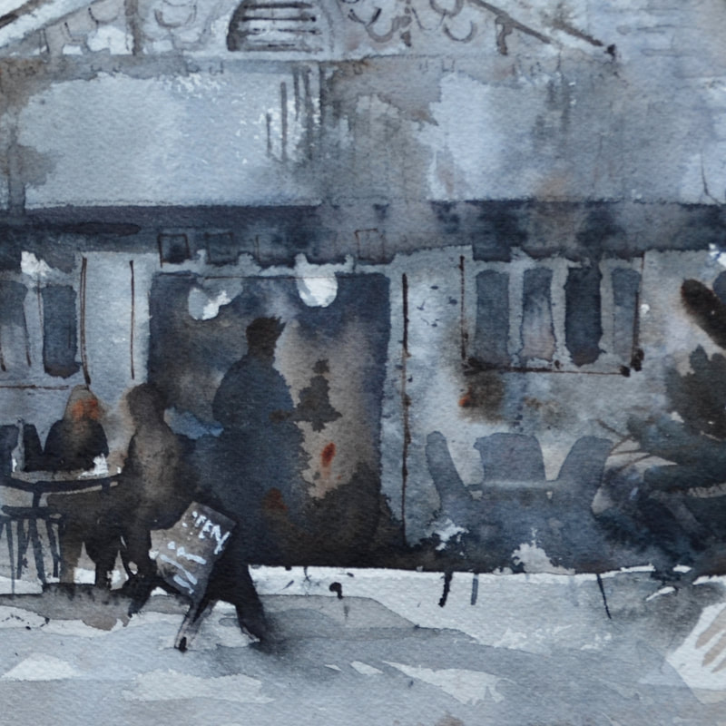
To be truthful, for me, grey is the most frightening colour – I don’t wear grey, I don’t like looking at it, I don’t have it in my house and I HATE grey cloudy days! So when I was told recently that my “greys” were greatly admired I was quite floored, this started a renewed process of investigation, what greys do I create and how do I use them?
Firstly, good quality watercolours are made from natural minerals (pigments) and due to these natural qualities, react and bounce off each other, quite fun to watch and experiment with. Manufactured blacks and greys are mostly made from a kiln firing process therefore they contain soot - for large washes they can be lifeless and dull and often dry substantially lighter than expected. Secondly, in watercolour, our staples are our complementaries (red vs green, purple vs yellow etc). For example, to neutralise red, I add a little green, a secondary colour containing blue and yellow. When I add green to red I have 3 primaries which means the greying process is started. I paint with tube paints and carefully select transparent watercolours, mostly I use Winsor & Newton pigments and then I add opaque or earth pigments for accents. My favourite palette includes winsor blue (red shade), permanent alizarin crimson and burnt sienna. Sometimes I swap the blue for winsor blue (green) or French ultramarine and alizarin for permanent rose or another transparent “pink” like permanent magenta. I choose this palette because each of these colours have good tinting strength, therefore this palette, with just enough water to mix, will make an exciting and fresh dark and, with diluting, will create fantastic luminous greys. I start by making a violet, for shadow areas a cool violet (ie more blue, less red) and depending on the palette of the day, I may add burnt sienna. For silvery greys try cobalt blue and permanent alizarin for a gorgeous violet then add just a wee touch of raw sienna or try winsor green and permanent alizarin or rose. Cerulean blue or cobalt blue plus burnt sienna, for darker greys try french ultramarine or indigo with burnt sienna. As you can see the sky’s the limit but of course this all depends on the pigments in your palette and what you can do with them – a matter of experimentation. To start with, I mix light value greys in my palette but I make sure I can still see little pockets of the ingredient colours; in other words, sloppy, inefficient colour mixing is best, partly because it ensures there is no accidental overmixing and further, it allows the poetry of watercolour to show. After washing in a light value Grey around whites, I mix a stronger grey with the same pigments but in different ratios so that, for example, I wash a warm grey over a cool grey. I then select one of my accent colours and charge it in and then spatter some of the other colours while it’s still damp. For me watercolour is about poetry, creating beauty and light and life. As Delacroix said 'Colour is the fruit of life' and developing a repertoire of greys will only enhance your colour work. have fun!! ciao Amanda
Have you ever struggled to get into just the right spot when you're painting in a group?
Everyone's elbowing each other trying to get the best possie!! You can either get into the jostle (yuck!) or get there early. Both, to me, are pointless because you never know what the model is going to do and I hate being stuck in a crowd. My solution is, no matter what's in front of you, the artist has to learn how to make a silk purse out of the sow's ear: use your creative brain to come up with a fine composition/design/idea and make it work (This is why I'm really good at painting feet)!! Test yourself, push your skills and make yourself come up with the goods. If permitted, dive in close at some point and get some photos so you have reference material for when you get back to your studio. My best strategy for painting en plein air is to grab a cushion, find some shade, get comfy and then look around to find my subject. A viewfinder is a handy gadget to avoid overwhelm and pin down a great composition. When I'm done with that view, i turn 5°, make sure I'm still in the shade, get comfy and paint - step and repeat!! Very sensible when you think of how much painting time can be wasted wandering around looking for the perfect subject - it's right there in front of you! have fun!! Amanda www.amandabrett.net edited from my original post 081214
Copyright © 2022 All images and text on Amanda's blog and website are the legal property of Amanda Brett and may not be reproduced without express permission from Amanda Brett or her authorised agent. Thank you for respecting her art and the livelihood of all artists. |
AuthorPaintBox Tips, secrets, random thoughts, 
Poetry in watercolour is made in the freedom of the here and now. Amanda Brett Inspiration exists, but it has to find you working - Pablo Picasso 
There are no mistakes in watercolour, just some extra surprises!! Categories
All
What my readers and viewers have to say
Your emails are so informative! I must confess I've watched a couple of your demos from beginning to end, and it makes me want to watercolor!!! I've only ever painted with oil or acrylics and haven't know how to begin with WC. Your content is excellent!
Susan VN Hi Amanda
Thank you for your tips. They inspired me to practise and I realised I haven’t been loading the brush properly. I learnt about adding more paint, and not water, to washes. In today’s tips I like the idea of painting with purpose. Your tips are very helpful. I very much appreciate receiving them. Elizabeth Hi Amanda I enjoyed your post and generous tips. Looked up Dan Burt I begin to see that you can colour any subject to give it pizazz so long as the tone and form is correct Certainly adding value now to my attempts Thanks heaps Annie
Yes very wise words. Agree with not fussing and agree with comments about good quality paint. Well written and inspirational as always. Cheers Janet xxxx Archives
July 2023
Copyright © 2022 All images and text on Amanda's blog and website are the the legal property of Amanda Brett and may not be reproduced without express permission from Amanda Brett or her authorised agent. Thank you for respecting her art and the livelihood of all artists.
|