There’s a lot of confusion about underpainting in watercolour. It’s somewhat similar to underpainting – or blocking-in in other mediums. In other words blocking-in colours strategically (or playing it wild to leave strategy at the door!). I have 2 processes for underpainting:
There’s another idea to consider: You can either leave it to dry or keep painting into it while it’s wet/damp becoming dry. Most watercolour painters are reluctant to paint into wet or damp but, personally, I find this the most fun, rewarding and absorbing element of watercolour. Just use thicker paint/less water and having a play with placing values to tell your story. Like me, you might need to change your brush to accommodate the amount of water you need so you can avoid blooms where you don’t want them. I map my painting out and consider my process before I start. For example, I need to know where to place the yellow for a lemon if I want a yellow lemon (next lemon with be pink!!). I stick with transparent colours and leave opaque and granulating pigments for later, this way I know that everything will work together nicely. Remember, for brighter more saturated colour, if you want purple, paint purple on top of purple, if you want red, paint red over red and so on. For more neutral colours, glazing complementaries over your under painting can have incredible effects. Having said this, one of my students pulled out an old painting with a French Ultramarine background. She overpainted with reds and yellows – I was so pleased that she made it work – fearless – excellent - ‘nuff said!! Underpainting in watercolour can enhance your colours making them stronger, richer and more exciting. Soft-edged background shapes add depth, volume and mystery, further, continuing while damp add richness of colour and value plus more soft edges becoming harder edged as the paper dries. Totally delicious!! By this time your painting is probably dry (or you need a break!) and your painting will be ready for some calligraphy detail marks with some lovely rich colour straight from the tube – can't beat it! Give your painting a final check – does your painting say what you want it to say? The cool thing is you don’t have to decide right now!! But do consider if it looks balanced, pleasing? Is there anything annoying you? I just discovered a problem area in a painting I thought I had resolved – so annoyed as I deliberately added “the problem” thinking I was so clever! Prop your painting upside down so you can see when you are walking past, this will give you a better understanding of the composition and structure, if it looks right upside down it will be right in its frame!! ciao cari pittori let me know what you think in the comments below!! 
2 Comments
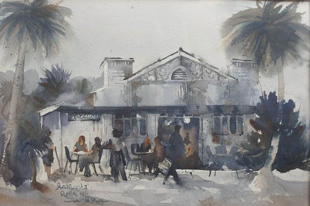 Blacksand, painted en plein air in Raglan NZ. Available from Splash 2022, Wellington NZ Blacksand, painted en plein air in Raglan NZ. Available from Splash 2022, Wellington NZ
A key issue for any artist is creating a focal point.
Have you ever asked yourself "Where should I start?" or "What's my story?" This is where your story is and where you want your viewers to look. Everything else is background. There are many ways to achieve this, my favourite is to divide my painting surface into thirds vertically and horizontally, aka the golden section, then use one of intersections for my focal point. This means that (unless your painting is square) your focal point will be unequal distance from any edge of your substrate, creating a discordance, a little bit of a shock – why isn’t it equal? It just feels like the natural spot! Many students ask me “where should I start?”. It doesn’t really matter except that, especially for beginners, a good place to start your painting is at the place that’s most exciting for you, the thing that got you interested, then build a background around it. This ensures you keep the background in the background and your focal area is full of exciting stuff and further, you’re enjoying what piqued your interest to start with. A focal point is also discussed as “your story”. Again I’m often asked “what do they mean, what is my story?” It doesn't have to be anything deep, dark and meaningful unless that's what you want to communicate. Your story is a description of what inspired you to paint: Eg I like the way the light hit the tablecloth and refracted through a glass of drinking water, making a super bright highlight on a pear and beautiful light and shadow shapes that danced over the folds of a tea towel. Write this in your sketch/notebook with your sketches, to keep your memory alive. This is a good habit for several reasons, but first of all, it aids your thinking processes; further, it’s your evidence of originality and your body of work and even more, galleries may ask you for descriptions; when stressed over preparing for shows the last thing you want to do is have to write descriptors – your early writings hold the key to your original inspiration. Along with your drawings, sketches and composition thumbnails, it is a good idea to write a list of accompaniments so you’re not stuck for ideas and feel forced to finish without having thought through thoroughly (crikey!) before you started. For example a table top painting might also include a vase and flowers, a suggestion of a chair, bottle of tomato sauce, a lemon and a spoon. In the background: light though a window, painting on the wall, books on a bookshelf and a table lamp. Once you have given your focal area a good start you can then move on to painting other areas of the painting and adjust and balance the painting later. It really all comes down to planning and understanding what you want to paint and why. Asking yourself these questions will help you to get to the heart of the matter quickly, help you to focus your concentration and get to picking up that brush sooner!! do feel free to comment or ask a question! ciao cari pittori!! 
Some thoughts on drawing!
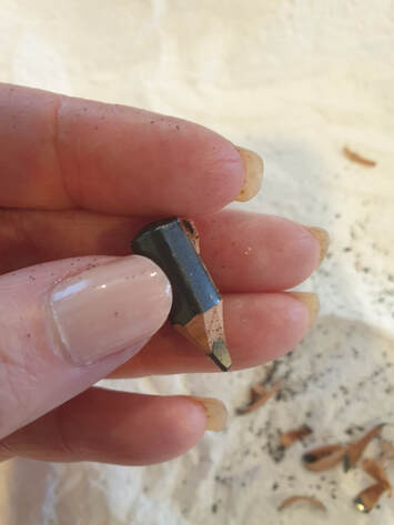
Drawing skills are essential. Your painting will improve out of sight just by spending 10-20 minutes observational drawing every day. Shapes must be good - note I didn't say "perfect". "Good" can also mean interesting, unique or beautiful. Design your artwork with design principles in mind. Accomplished drawers/designers/artists can and do paint without drawing on their paper BUT 99.9% will have mapped out their design idea as a sketch first and will have spent much time studying and researching and planning – they’ve possibly painted a similar subject 500 times before – they know it well but have found a new intriguing “thing”. Some watercolour tutors disagree with this, it shows in their work. Drawing can become a 5-minute exercise in order to create a good painting (oil, acrylic, watercolour, sculpture, pastel), it doesn't matter the medium, art is art. "Wrong" marks are full of character and shouldn't be erased (unless they're really annoying and stuck in your head then have at it!). It takes skill and practice - draw every day, start simple. An eraser is not an essential tool but your sharpening device is. There are many different purposes for drawing, some for me are:
The word "perfect" must be stricken from your vocabulary - it is meaningless because it can't be articulated, is subjective and stops us from doing what we really want to do! Please comment and ask me questions and let me know how you're getting on!! 
|
AuthorPaintBox Tips, secrets, random thoughts, 
Poetry in watercolour is made in the freedom of the here and now. Amanda Brett Inspiration exists, but it has to find you working - Pablo Picasso 
There are no mistakes in watercolour, just some extra surprises!! Categories
All
What my readers and viewers have to say
Your emails are so informative! I must confess I've watched a couple of your demos from beginning to end, and it makes me want to watercolor!!! I've only ever painted with oil or acrylics and haven't know how to begin with WC. Your content is excellent!
Susan VN Hi Amanda
Thank you for your tips. They inspired me to practise and I realised I haven’t been loading the brush properly. I learnt about adding more paint, and not water, to washes. In today’s tips I like the idea of painting with purpose. Your tips are very helpful. I very much appreciate receiving them. Elizabeth Hi Amanda I enjoyed your post and generous tips. Looked up Dan Burt I begin to see that you can colour any subject to give it pizazz so long as the tone and form is correct Certainly adding value now to my attempts Thanks heaps Annie
Yes very wise words. Agree with not fussing and agree with comments about good quality paint. Well written and inspirational as always. Cheers Janet xxxx Archives
July 2023
Copyright © 2022 All images and text on Amanda's blog and website are the the legal property of Amanda Brett and may not be reproduced without express permission from Amanda Brett or her authorised agent. Thank you for respecting her art and the livelihood of all artists.
|