We’ve discussed in class many times and I’ve had it on my mind to write about how to choose colours but have never quite gotten to getting it on paper!
It’s a BIG subject and once you know a little the rest is dangerous!! Lol!! There are many ways to choose colours but maybe 3-4 types that can be simplified (unless you want to find out more about colour theory):
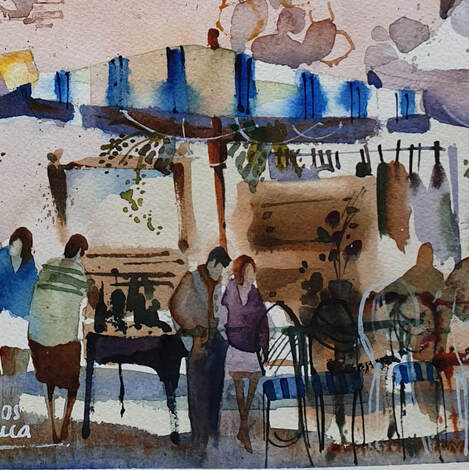
Firstly, an optimum way to simplify is to have a set of primaries and mix your neutrals and then add strategically placed splodges of high chroma colour to add accents and interest. An excellent way to work on your colour mixing and develop your knowledge of your colours and how they work together. For painting some form of realism and local colour (the colous you see in a scene), I use mostly the same pigment colours in every painting or at least versions of. These colour pigments are my workhorse pigments, I can mix every tone, every shade, value and colour. Sometimes I swap a cool for a warm version or vice versa. To start with it’s worth understanding the pigments you already have and what you can do with them It's not always prudent or practical to go and buy another tube of paint, let's face it, is it pragmatic to own 100 tubes of paint, 90 of which you won’t know what to do with? Further, if you’re painting realism eg landscapes, there are few colour pigments true to nature. To start just get the transparent pigments I recommend, and mix your own colour wheel. This will show you the strengths and weaknesses of the pigments - how rich and dark, their tinting strengths and other characteristics. The key is to understand the colour wheel you've created and continue to play with those colours to develop a deeper understanding. Whether I’m painting out or in my studio I often follow a process of primary colours but I might swap one of them out just to zhuzh (thanks Suzanne!!) things up a little. For example, a warm blue for a cool, cool red for a warm etc, you get the drift. Secondly, for many years I focussed on a split complementary palette. For example, orange is opposite blue on the colour wheel, so I might decide blue is my dominant colour but instead of orange I could use the hues either side of orange (red orange and yellow orange) and maybe step one to a tint the other to a shade. Check out the other colour selection diagrams on a proprietary colour wheel for additional ideas and colour concepts to play with. Another favourite palette is a tertiary palette (colours mixed from primaries), sometimes this just falls out of my brush, sometimes it seems the obvious choice, however, it feels a natural palette to paint with and I‘m often pleased with the results. For any style or genre of painting, dominance is the key to life!! Abstract or realism, I try to find a foundation colour that speaks to me for that subject that day for my mood at the time. Yesterday I painted warm blues, the day before was all about cool greens. I painted warm blues yesterday and cool greens the day before. Effectively I piled up all my greens, played and chose from there. In my early days of painting watercolour, playing with colour was the key to my inspiration. Even a plein air painting/study benefits from a limited palette. My all-time favourite is “Early morning” with a pink (alizarin crimson) underpainting and “Networking” with a cool buff/grey/sludgy dominance and the subject in warm and cool blues with an accent of cool opaque blues and burnt sienna. Sometimes I just have a hankering to paint pink and then tomorrow green. I have been known to select every pink then add a splash of orange and a sweep or two of turquoise, it just depends on where the mood takes me. What colours do you like? Head down to your local art gallery and actively search for colour combinations, whether you like the paintings/art or not, its a good exercise in palette selection and most importantly, discovering your own likes and dislikes. let me know how you get on - leave a comment!! :) 
3 Comments
I received a very kind compliment recently, my paintings remind them of Dan Burt’s paintings. I’d never heard of Dan Burt but, man, I know his work now!! Totally amazing – PLUS totally incredible colour!!
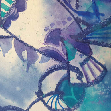
This led me to think about the misconception about watercolour – that it’s wishy-washy, subdued, delicate and painted by Victorian ladies. YES 150 YEARS AGO!! We’re now in the 21st century and along with my peers, watercolours are now a contemporary medium painted in many styles. I’m known for my strong colour – that’s how I see the world, that how I want the world to be. I love the challenge of watercolour – it’s not for the faint of heart! If you’re happy to paint on the edge of your seat from time-to-time, watercolour is the best medium! Skydiving is not the only means to get an adrenaline rush! Many years ago I made a deliberate decision to paint stronger vibrant colour. It was a natural step for me, as I’ve always put unusual colours together. As I embarked on my professional artist’s journey, it seemed that, partly due to the lack of appreciation for watercolours back then, my work needed stronger colour to stand amongst the strong colours of opaque medium. A tiny 5ml tube of watercolour is confusing, how far will that tiny 5ml tube of paint go? Quite far if you are painting small once or twice a week, not far enough if you paint big every day. Buy artist’s quality paint and the little 5ml tube will go even further. This is going to sound strange but, buy 100% cotton rag paper and you will notice good quality paint goes even further and is more vibrant. A good practice for the watercolour painter is to start with a tiny amount of paint pigment and add water to make a nice puddle to paint with. Next build up some stronger colour with more paint and less water, then even more paint and much less water = DO NOT ADD MORE WATER, do not “clean” your brush between washes. Please note creating a large area wash is all about starting off with lots of water and then reducing the amount of water while you are increasing the amount of pigment. By dipping into your water pot too often, your brush’s water ratio will be out of whack and in danger of diluting your wash and creating blooms where you don’t want them. This practice will grow your understanding of water-to-paint-to-brush-to-paper ratios. Further the watercolour painter should be mindful of the same water-to-pigment ratio throughout the whole painting. Even with a good command of values, a watercolour can look insipid without a good variety of pigment strength. Another weapon in your armoury for vibrant colour is to remind yourself to lay down your colour confidently and then DON’T TOUCH IT! Hands in your pockets – walk away!! Continual fussing and excessive brushstrokes lead to dull colour. When glazing colour or layering colour, to add richness and vibrancy, consider using the same colours/pigments ie if you are painting a lemon, then paint the same colour in both washes. For example if I underpaint and let blue flow through my lemon and then the second pass (glaze) is yellow, my lemon is unlikely to be a bright saturate colour. I’m not saying it’s wrong, I’m saying think about your colours and how you want to use them, what you want to achieve. Add a good glob of fresh artist’s quality paint to your palette every week, let it set up overnight. Before you begin your painting session, give it a spritz of water and you’re good to go! Continual scrubbing at dry paint (aka bird poop = poor quality paint) will distract you from creating. It’s imperative to use the right brush for the job at hand. A small brush will not help you to lay down a sky wash – it won’t hold enough water to form a bead, your previous marks will dry too soon and you’ll end up with brush marks and blooms. For beginners, too big a brush with a good point and fat belly will do a good job for you. Practice with it and learn how to use it, with a good brush it is possible to paint a whole painting, start-to-finish, with just this one brush. ciao cari pittori let me know what you think in the comments below!!
|
AuthorPaintBox Tips, secrets, random thoughts, 
Poetry in watercolour is made in the freedom of the here and now. Amanda Brett Inspiration exists, but it has to find you working - Pablo Picasso 
There are no mistakes in watercolour, just some extra surprises!! Categories
All
What my readers and viewers have to say
Your emails are so informative! I must confess I've watched a couple of your demos from beginning to end, and it makes me want to watercolor!!! I've only ever painted with oil or acrylics and haven't know how to begin with WC. Your content is excellent!
Susan VN Hi Amanda
Thank you for your tips. They inspired me to practise and I realised I haven’t been loading the brush properly. I learnt about adding more paint, and not water, to washes. In today’s tips I like the idea of painting with purpose. Your tips are very helpful. I very much appreciate receiving them. Elizabeth Hi Amanda I enjoyed your post and generous tips. Looked up Dan Burt I begin to see that you can colour any subject to give it pizazz so long as the tone and form is correct Certainly adding value now to my attempts Thanks heaps Annie
Yes very wise words. Agree with not fussing and agree with comments about good quality paint. Well written and inspirational as always. Cheers Janet xxxx Archives
July 2023
Copyright © 2022 All images and text on Amanda's blog and website are the the legal property of Amanda Brett and may not be reproduced without express permission from Amanda Brett or her authorised agent. Thank you for respecting her art and the livelihood of all artists.
|