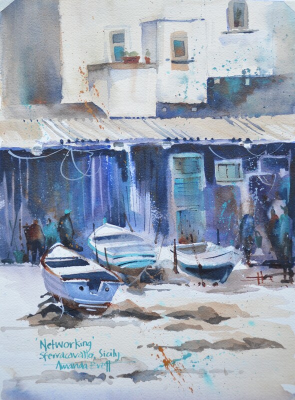
 Networking, Sferracavallo Sicily Networking, Sferracavallo Sicily
I get many emails and questions about my palette, ie, the colours I have selected.
It took me a long time to get to this palette but once I decided it was an obvious choice. For what seemed an interminable length of time, I was on a continual search – what colour for this? What colour for that? In the end (really it was a new beginning) I selected transparent primaries that would allow me to mix super rich darks and any other colour, cool, warm – whatever I would need! My current foundation palette is made up of 3 transparent primaries plus Burnt Sienna (my most favourite colour and pigment). On my palette is Permanent Alizarin Crimson, Winsor Blue (Red Shade) and Quinacridone gold. Another primary triad I keep on my palette is Winsor Blue (green shade), Permanent rose and raw sienna. Temper this info in that I mostly use quinacridone gold and burnt sienna for mixing greens and neutralising. All these colours work beautifully together mixing secondaries and other cool or warm versions. Sometimes I dip into other workhorse pigments including French Ultramarine, Winsor Green, Yellow Ochre, Indian Yellow and cobalt blue. Avoid dependency on online colour "recipes", much of the fun in painting is playing with your colours and making your own discoveries everyday. Further this play will set you up for learning your likes and dislikes (eg colour, pigment, medium and paper etc) and lead you to your own process of creativity. I always start my day playing with colour which leads me into inspiration and more creative sessions. To be truthful, going to the art shop is like going to the candy store … so hard to resist all those amazing colours!! Further, its even harder to resist sets of colour! However, I find a set of colours is like buying an eyeshadow palette, half of which I won’t use. In the long run it’s better and more economical to choose a foundation palette of good quality transparent primaries plus a couple of “exotics” to make yourself happy!! See my vlog #129 As always, I am very grateful for every thumbs up, so please click below if you liked this article. I’d also love to read any comments on this theme, so let me know your thoughts below. Ciao cari pittori 
0 Comments
There’s a lot of confusion about underpainting in watercolour. It’s somewhat similar to underpainting – or blocking-in in other mediums. In other words blocking-in colours strategically (or playing it wild to leave strategy at the door!). I have 2 processes for underpainting:
There’s another idea to consider: You can either leave it to dry or keep painting into it while it’s wet/damp becoming dry. Most watercolour painters are reluctant to paint into wet or damp but, personally, I find this the most fun, rewarding and absorbing element of watercolour. Just use thicker paint/less water and having a play with placing values to tell your story. Like me, you might need to change your brush to accommodate the amount of water you need so you can avoid blooms where you don’t want them. I map my painting out and consider my process before I start. For example, I need to know where to place the yellow for a lemon if I want a yellow lemon (next lemon with be pink!!). I stick with transparent colours and leave opaque and granulating pigments for later, this way I know that everything will work together nicely. Remember, for brighter more saturated colour, if you want purple, paint purple on top of purple, if you want red, paint red over red and so on. For more neutral colours, glazing complementaries over your under painting can have incredible effects. Having said this, one of my students pulled out an old painting with a French Ultramarine background. She overpainted with reds and yellows – I was so pleased that she made it work – fearless – excellent - ‘nuff said!! Underpainting in watercolour can enhance your colours making them stronger, richer and more exciting. Soft-edged background shapes add depth, volume and mystery, further, continuing while damp add richness of colour and value plus more soft edges becoming harder edged as the paper dries. Totally delicious!! By this time your painting is probably dry (or you need a break!) and your painting will be ready for some calligraphy detail marks with some lovely rich colour straight from the tube – can't beat it! Give your painting a final check – does your painting say what you want it to say? The cool thing is you don’t have to decide right now!! But do consider if it looks balanced, pleasing? Is there anything annoying you? I just discovered a problem area in a painting I thought I had resolved – so annoyed as I deliberately added “the problem” thinking I was so clever! Prop your painting upside down so you can see when you are walking past, this will give you a better understanding of the composition and structure, if it looks right upside down it will be right in its frame!! ciao cari pittori let me know what you think in the comments below!! 
I received a very kind compliment recently, my paintings remind them of Dan Burt’s paintings. I’d never heard of Dan Burt but, man, I know his work now!! Totally amazing – PLUS totally incredible colour!!
This led me to think about the misconception about watercolour – that it’s wishy-washy, subdued, delicate and painted by Victorian ladies. YES 150 YEARS AGO!! We’re now in the 21st century and along with my peers, watercolours are now a contemporary medium painted in many styles. I’m known for my strong colour – that’s how I see the world, that how I want the world to be. I love the challenge of watercolour – it’s not for the faint of heart! If you’re happy to paint on the edge of your seat from time-to-time, watercolour is the best medium! Skydiving is not the only means to get an adrenaline rush! Many years ago I made a deliberate decision to paint stronger vibrant colour. It was a natural step for me, as I’ve always put unusual colours together. As I embarked on my professional artist’s journey, it seemed that, partly due to the lack of appreciation for watercolours back then, my work needed stronger colour to stand amongst the strong colours of opaque medium. A tiny 5ml tube of watercolour is confusing, how far will that tiny 5ml tube of paint go? Quite far if you are painting small once or twice a week, not far enough if you paint big every day. Buy artist’s quality paint and the little 5ml tube will go even further. This is going to sound strange but, buy 100% cotton rag paper and you will notice good quality paint goes even further and is more vibrant. A good practice for the watercolour painter is to start with a tiny amount of paint pigment and add water to make a nice puddle to paint with. Next build up some stronger colour with more paint and less water, then even more paint and much less water = DO NOT ADD MORE WATER, do not “clean” your brush between washes. Please note creating a large area wash is all about starting off with lots of water and then reducing the amount of water while you are increasing the amount of pigment. By dipping into your water pot too often, your brush’s water ratio will be out of whack and in danger of diluting your wash and creating blooms where you don’t want them. This practice will grow your understanding of water-to-paint-to-brush-to-paper ratios. Further the watercolour painter should be mindful of the same water-to-pigment ratio throughout the whole painting. Even with a good command of values, a watercolour can look insipid without a good variety of pigment strength. Another weapon in your armoury for vibrant colour is to remind yourself to lay down your colour confidently and then DON’T TOUCH IT! Hands in your pockets – walk away!! Continual fussing and excessive brushstrokes lead to dull colour. When glazing colour or layering colour, to add richness and vibrancy, consider using the same colours/pigments ie if you are painting a lemon, then paint the same colour in both washes. For example if I underpaint and let blue flow through my lemon and then the second pass (glaze) is yellow, my lemon is unlikely to be a bright saturate colour. I’m not saying it’s wrong, I’m saying think about your colours and how you want to use them, what you want to achieve. Add a good glob of fresh artist’s quality paint to your palette every week, let it set up overnight. Before you begin your painting session, give it a spritz of water and you’re good to go! Continual scrubbing at dry paint (aka bird poop = poor quality paint) will distract you from creating. It’s imperative to use the right brush for the job at hand. A small brush will not help you to lay down a sky wash – it won’t hold enough water to form a bead, your previous marks will dry too soon and you’ll end up with brush marks and blooms. For beginners, too big a brush with a good point and fat belly will do a good job for you. Practice with it and learn how to use it, with a good brush it is possible to paint a whole painting, start-to-finish, with just this one brush. ciao cari pittori let me know what you think in the comments below!! 
|
AuthorPaintBox Tips, secrets, random thoughts, 
Poetry in watercolour is made in the freedom of the here and now. Amanda Brett Inspiration exists, but it has to find you working - Pablo Picasso 
There are no mistakes in watercolour, just some extra surprises!! Categories
All
What my readers and viewers have to say
Your emails are so informative! I must confess I've watched a couple of your demos from beginning to end, and it makes me want to watercolor!!! I've only ever painted with oil or acrylics and haven't know how to begin with WC. Your content is excellent!
Susan VN Hi Amanda
Thank you for your tips. They inspired me to practise and I realised I haven’t been loading the brush properly. I learnt about adding more paint, and not water, to washes. In today’s tips I like the idea of painting with purpose. Your tips are very helpful. I very much appreciate receiving them. Elizabeth Hi Amanda I enjoyed your post and generous tips. Looked up Dan Burt I begin to see that you can colour any subject to give it pizazz so long as the tone and form is correct Certainly adding value now to my attempts Thanks heaps Annie
Yes very wise words. Agree with not fussing and agree with comments about good quality paint. Well written and inspirational as always. Cheers Janet xxxx Archives
July 2023
Copyright © 2022 All images and text on Amanda's blog and website are the the legal property of Amanda Brett and may not be reproduced without express permission from Amanda Brett or her authorised agent. Thank you for respecting her art and the livelihood of all artists.
|