|
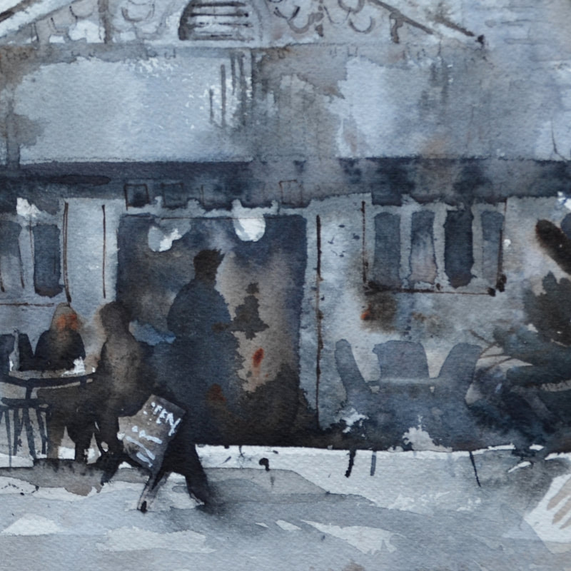
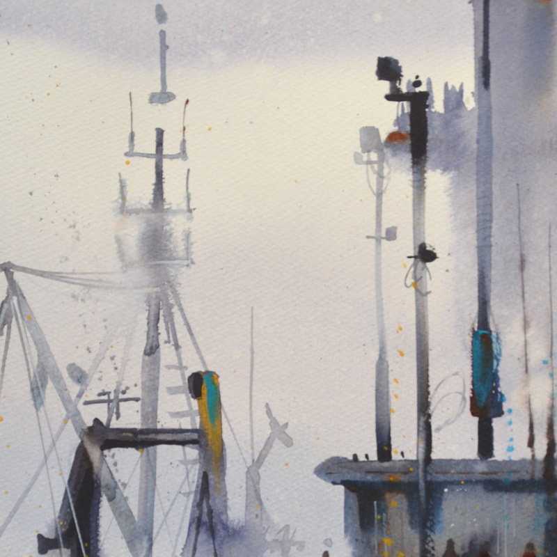
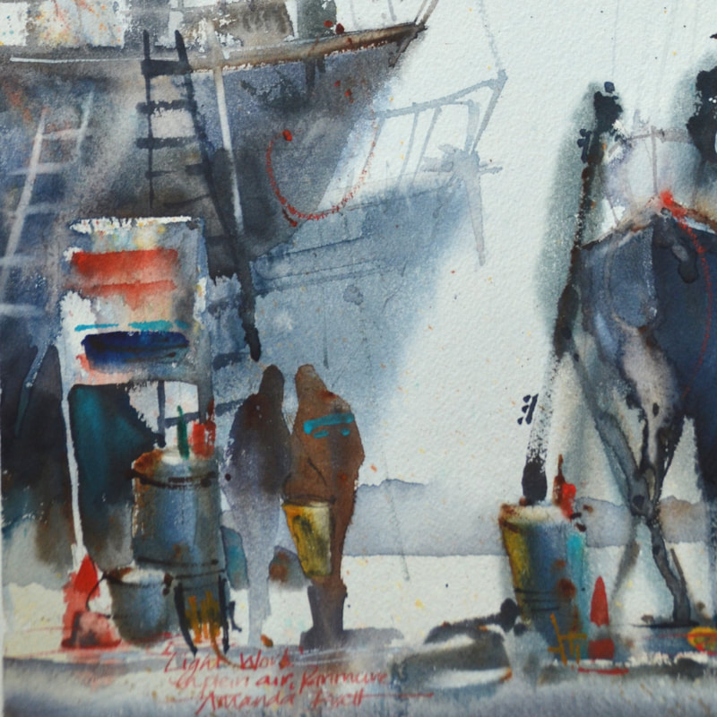
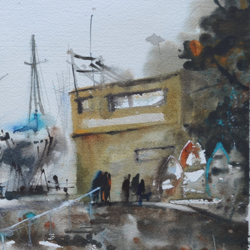
To be truthful, for me, grey is the most frightening colour – I don’t wear grey, I don’t like looking at it, I don’t have it in my house and I HATE grey cloudy days! So when I was told recently that my “greys” were greatly admired I was quite floored, this started a renewed process of investigation, what greys do I create and how do I use them?
Firstly, good quality watercolours are made from natural minerals (pigments) and due to these natural qualities, react and bounce off each other, quite fun to watch and experiment with. Manufactured blacks and greys are mostly made from a kiln firing process therefore they contain soot - for large washes they can be lifeless and dull and often dry substantially lighter than expected. Secondly, in watercolour, our staples are our complementaries (red vs green, purple vs yellow etc). For example, to neutralise red, I add a little green, a secondary colour containing blue and yellow. When I add green to red I have 3 primaries which means the greying process is started. I paint with tube paints and carefully select transparent watercolours, mostly I use Winsor & Newton pigments and then I add opaque or earth pigments for accents. My favourite palette includes winsor blue (red shade), permanent alizarin crimson and burnt sienna. Sometimes I swap the blue for winsor blue (green) or French ultramarine and alizarin for permanent rose or another transparent “pink” like permanent magenta. I choose this palette because each of these colours have good tinting strength, therefore this palette, with just enough water to mix, will make an exciting and fresh dark and, with diluting, will create fantastic luminous greys. I start by making a violet, for shadow areas a cool violet (ie more blue, less red) and depending on the palette of the day, I may add burnt sienna. For silvery greys try cobalt blue and permanent alizarin for a gorgeous violet then add just a wee touch of raw sienna or try winsor green and permanent alizarin or rose. Cerulean blue or cobalt blue plus burnt sienna, for darker greys try french ultramarine or indigo with burnt sienna. As you can see the sky’s the limit but of course this all depends on the pigments in your palette and what you can do with them – a matter of experimentation. To start with, I mix light value greys in my palette but I make sure I can still see little pockets of the ingredient colours; in other words, sloppy, inefficient colour mixing is best, partly because it ensures there is no accidental overmixing and further, it allows the poetry of watercolour to show. After washing in a light value Grey around whites, I mix a stronger grey with the same pigments but in different ratios so that, for example, I wash a warm grey over a cool grey. I then select one of my accent colours and charge it in and then spatter some of the other colours while it’s still damp. For me watercolour is about poetry, creating beauty and light and life. As Delacroix said 'Colour is the fruit of life' and developing a repertoire of greys will only enhance your colour work. have fun playing!! ciao Amanda
10 Comments
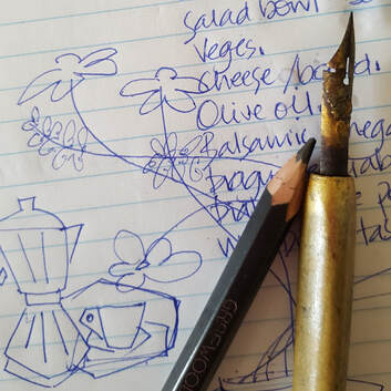
New Students are often fearful of putting the brush to paper. Some people are able to articulate this fear and its foundations, mostly not.
Many students tell me of the harsh and cruel comments they received about their art when they were young. From teachers, parents and friends – some well-meaning, some not, some from overt jealousy. It’s not easy to stop this “stuff”, other people’s “stuff”. It gets in our head and, let’s face it, sometimes we can’t stop it in it’s tracks even as adults. Children don’t always have the same awareness (sometimes they’re better at it than grown-ups!) that perhaps the comments come from an adult’s sad place. Their bad day still affects us, it still hurts, we don’t understand – that’s ok! What I want you to know is, you don’t have to be affected by other people’s fears or opinions. Mostly they’re irrelevant. Your own opinion and pleasure is what matters. As you grow, you will develop your art - learn, love and live your art. The best way to banish fear is to just do it – just paint, no expectations, just enjoy the process and have fun! 

Whether you want to paint realism or abstract, the backbone is your ability “to see” and recreate what you see.
Your ability to see and developing this ability, is all about design and being able to see and create pleasing shapes, designs, values, colour temperatures and other principles of design. Sometimes the differences are so minute, barely perceptible. Sometimes your job as an artist is to exaggerate to make sure your story is understood, sometimes your job is to diminish. Learning to see is a learnable skill. After all, you can drive a car, write your name and you can knit, sew, hammer a nail and mow the lawn. Therefore, you have the ability to learn to draw – learn to see. If it’s been a while since you last sketched, keep it simple, small and do-able – lemons, apples, cup and saucer, whatever is handy, just slow down, enjoy the process, concentrate and relax. ciao cari pittori
|

AuthorPaintBox Tips, secrets, random thoughts, 
Poetry in watercolour is made in the freedom of the here and now. Amanda Brett Inspiration exists, but it has to find you working - Pablo Picasso 
There are no mistakes in watercolour, just some extra surprises!! Categories
All
What my readers and viewers have to say
Your emails are so informative! I must confess I've watched a couple of your demos from beginning to end, and it makes me want to watercolor!!! I've only ever painted with oil or acrylics and haven't know how to begin with WC. Your content is excellent!
Susan VN Hi Amanda
Thank you for your tips. They inspired me to practise and I realised I haven’t been loading the brush properly. I learnt about adding more paint, and not water, to washes. In today’s tips I like the idea of painting with purpose. Your tips are very helpful. I very much appreciate receiving them. Elizabeth Hi Amanda I enjoyed your post and generous tips. Looked up Dan Burt I begin to see that you can colour any subject to give it pizazz so long as the tone and form is correct Certainly adding value now to my attempts Thanks heaps Annie
Yes very wise words. Agree with not fussing and agree with comments about good quality paint. Well written and inspirational as always. Cheers Janet xxxx Archives
May 2026
Copyright © 2022 All images and text on Amanda's blog and website are the the legal property of Amanda Brett and may not be reproduced without express permission from Amanda Brett or her authorised agent. Thank you for respecting her art and the livelihood of all artists.
|