I received a very kind compliment recently, my paintings remind them of Dan Burt’s paintings. I’d never heard of Dan Burt but, man, I know his work now!! Totally amazing – PLUS totally incredible colour!!
This led me to think about the misconception about watercolour – that it’s wishy-washy, subdued, delicate and painted by Victorian ladies. YES 150 YEARS AGO!! We’re now in the 21st century and along with my peers, watercolours are now a contemporary medium painted in many styles. I’m known for my strong colour – that’s how I see the world, that how I want the world to be. I love the challenge of watercolour – it’s not for the faint of heart! If you’re happy to paint on the edge of your seat from time-to-time, watercolour is the best medium! Skydiving is not the only means to get an adrenaline rush! Many years ago I made a deliberate decision to paint stronger vibrant colour. It was a natural step for me, as I’ve always put unusual colours together. As I embarked on my professional artist’s journey, it seemed that, partly due to the lack of appreciation for watercolours back then, my work needed stronger colour to stand amongst the strong colours of opaque medium. A tiny 5ml tube of watercolour is confusing, how far will that tiny 5ml tube of paint go? Quite far if you are painting small once or twice a week, not far enough if you paint big every day. Buy artist’s quality paint and the little 5ml tube will go even further. This is going to sound strange but, buy 100% cotton rag paper and you will notice good quality paint goes even further and is more vibrant. A good practice for the watercolour painter is to start with a tiny amount of paint pigment and add water to make a nice puddle to paint with. Next build up some stronger colour with more paint and less water, then even more paint and much less water = DO NOT ADD MORE WATER, do not “clean” your brush between washes. Please note creating a large area wash is all about starting off with lots of water and then reducing the amount of water while you are increasing the amount of pigment. By dipping into your water pot too often, your brush’s water ratio will be out of whack and in danger of diluting your wash and creating blooms where you don’t want them. This practice will grow your understanding of water-to-paint-to-brush-to-paper ratios. Further the watercolour painter should be mindful of the same water-to-pigment ratio throughout the whole painting. Even with a good command of values, a watercolour can look insipid without a good variety of pigment strength. Another weapon in your armoury for vibrant colour is to remind yourself to lay down your colour confidently and then DON’T TOUCH IT! Hands in your pockets – walk away!! Continual fussing and excessive brushstrokes lead to dull colour. When glazing colour or layering colour, to add richness and vibrancy, consider using the same colours/pigments ie if you are painting a lemon, then paint the same colour in both washes. For example if I underpaint and let blue flow through my lemon and then the second pass (glaze) is yellow, my lemon is unlikely to be a bright saturate colour. I’m not saying it’s wrong, I’m saying think about your colours and how you want to use them, what you want to achieve. Add a good glob of fresh artist’s quality paint to your palette every week, let it set up overnight. Before you begin your painting session, give it a spritz of water and you’re good to go! Continual scrubbing at dry paint (aka bird poop = poor quality paint) will distract you from creating. It’s imperative to use the right brush for the job at hand. A small brush will not help you to lay down a sky wash – it won’t hold enough water to form a bead, your previous marks will dry too soon and you’ll end up with brush marks and blooms. For beginners, too big a brush with a good point and fat belly will do a good job for you. Practice with it and learn how to use it, with a good brush it is possible to paint a whole painting, start-to-finish, with just this one brush. ciao cari pittori let me know what you think in the comments below!! 
10 Comments
Hello there *|FNAME|*
I can't tell you how many times my students say these words - it occurs to me that none of them are useful, enlightening or positive. All they achieve is making people feel miserable about what they're trying to accomplish! Let's strike these words from our vocabulary TODAY!! Mud In watercolour there is an overuse of the word mud. It is now used to describe anything the painter doesn’t like in their painting - without evaluation or critique – it’s just mud! Actual mud is very difficult to create, however people who have painted in other mediums seem to be particularly adept at the chief skill required – overmixing. Mud is the usual description when the lights (whites) are lost and the painting seems overrun with neutrals and mid values. The true issue is the painting is not finished and seems awash with nothing in particular. its a difficult stage to push through. Watercolour needs a light touch in every possible way, much like making scones or a difficult putt – less is more! In the early phase of your learning, make things easier for yourself and only use a good quality brand of transparent colours – you’ll only need 3 primaries to start with. Mix your colours on the paper with one or two brushstrokes (I’m not kidding!) and then keep your hands off – walk away and make a cuppa!! The problem with the word mud is it’s negative connotations – mud from the river is dirty thick and horrible. In watercolour painting, what mud really is, is neutral. It makes your brights and focal point stand-out. To make neutrals while retaining harmony in your painting, all you need to neutralise a colour is to add the tiniest touch of it’s complementary. Fix Another overused word. I have to admit, I say this myself from time-to-time, there is a difference however - I know why I'm saying it - I'm saying it with purpose and knowledge. Beginners are saying it because that's what they've heard other people say and they lack confidence in their work. Again, the actual problem is your painting is not finished. It’s out of balance and your creative brain knows it but you are not in practised at evaluating or articulating it. The word “fix” implies our painting is wrong or bad. For the beginner the difficulty is how to resolve our work so we can finish. It’s not easy, no art is. Further, nothing worthwhile is easy, that’s why we do it! It’s a journey, learning to see, learning to draw and learning to paint. Learning what we like and don’t like. Learning to talk to ourselves in more productive and kinder ways. Perfect I feel like a broken record about this, it comes up so often. Sometimes I get so angry and frustrated that so many creative people have been thwarted by this nonsense. Firstly, we’re making something by hand – it’s going to have some exciting variations! “Perfection” is a way for our creativity to be curbed by ourselves or by others. We’re really repeating what some dummy said to us when we were kids. I was lucky as a young maker. My role model mother was a constant maker but with a few children she had little time for neatening edges and playing with niceties. She made us gorgeous little dresses with coats and bonnets to match. A super clever woman but DON’T CHECK the inside!! Actually, you've reminded me that my sister's dance costume fell apart on stage once, I don't think she was phased at all - the show must go on - what a great girl - just like her Mum!! I remember everyone running around looking for safety pins!! Here’s a question: What is Perfection? Describe it. I defy you!! Let’s also remember, one man’s meat is another man’s poison. In my experience “Perfect” is used as a manipulation tool. They can’t describe how they want “it” and leave you to make up your own exciting creation and then they are very quick to tell you it’s not Perfect, it’s wrong and how badly you’ve done! But they still don’t tell you what they want!! Do not get sucked into this vortex of someone else’s nonsense, don’t be a victim and don’t pass it on!! Mistake Who cares? As above, the reality is, your painting is not finished and needs something to balance it. Work out what it needs to be resolved. Does it need to be lighter, darker, less bright, more bright? There are no mistakes in watercolour, however, you might get a few surprises along the way. And this, my friend, is the gift that does our heads in!! When we receive a surprise from the watercolour Gods, we need to stop and think. How can we use this gift? The answer might take a little while to present itself, we just need to pretend we are patient and wait for it to appear. Initially, I recommend ignoring it. I often find by the time I finish my painting, I’ve forgotten about it. However, if it’s still bothering you, it must need to be resolved. Watercolour is Backwards Whenever I hear this it makes me crack up – it’s just so stupid! It’s never said by a true watercolour artist. Watercolour is a forward medium. We start with white paper, then add a light value, then we add a medium value, then a mid dark value and finally a dark value. – we come forward from light to dark! Much the same as pencil sketching. Only opaque medium artists focus on obliterating the white canvas with a dark value and then paint increasingly lighter values - now that’s backwards! ‘Nuff said!! Fade modern watercolours don't fade they dry lighter much like acrylics dry darker. the watercolour painter must compensate for this and use more pigment - if it looks right when its wet, its probably wrong. using the word fade perpetuates old stories and nonsense. As in any situation anywhere, using the right words sets the story straight and reduces misunderstandings. ciao cari pittori!! 
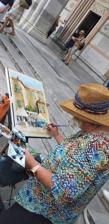
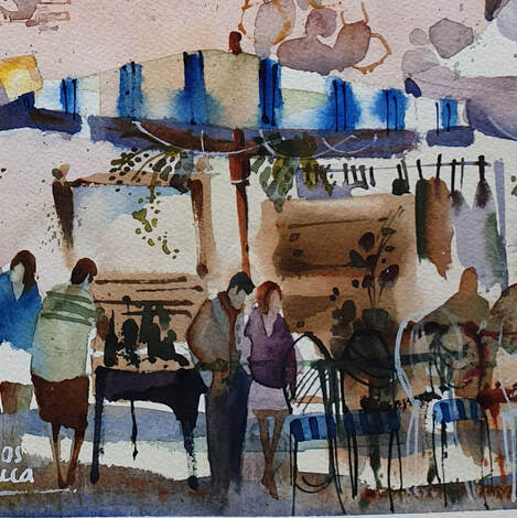
There’s nothing easy about painting watercolour en plein air but, for me, it is an exhilarating and fun experience.
My early attempts, however, were difficult and my paintings absolutely atrocious! It seemed to take me forever to get to grips with this new style of painting in the great outdoors. Without realising, I was faithfully following the 80/20 rule, 80% observation 20% drawing /painting. Later it dawned on me: this rule does not apply to painting watercolour en plein air - I was trying to follow a guideline for the constant situation of studio/observational drawing. When painting in the field, from the time you select your subject to your end-game, you have about 1-1.5 hours, 2 hours at most, to capture the subject before light and atmospheric conditions change too much. No mean feat but, if you practice, you will improve every time. Another element to consider is the subject. My first attempts at painting en plein air were with groups of artists who love painting landscapes. For me, it was a big problem. Although I love good quality landscape paintings, I’m not interested in painting them myself. I’m a city girl afterall, I’m attuned to light and shadows bouncing around architecture and the people who inhabit amazing spaces. Just think of Lisa Douglas (Eva Gabor) and you'll have hit your nail on the head! I often tell my students to slow their painting process down but in the case of painting watercolour en plein air, I’m going to contradict myself and tell you to speed up! Speed up so you catch the light and changing conditions, Remember, watercolour is a fast medium. Give yourself 5 minutes, and only 5 minutes, to take photos and sketch 1 or 2 value thumbnails and most importantly, take a mental snapshot. Make your memory work for you and, even if you think your result is "wrong", your work will be formed of the essence of your subject. Perfetto!! What a great excuse to go out and paint it again!! Your next work at the same scene will include different features and details and the next different again. My personal strategy is to map the subject onto my watercolour paper with a 5 minute sketch and then not refer to the actual scene again, even if I have to turn away from it. I am painting my interpretation of the scene not a photograph. Changing light and shadows become mighty confusing and create confusing paintings. Learn the tools you need to assist you:
x 
|

AuthorPaintBox Tips, secrets, random thoughts, 
Poetry in watercolour is made in the freedom of the here and now. Amanda Brett Inspiration exists, but it has to find you working - Pablo Picasso 
There are no mistakes in watercolour, just some extra surprises!! Categories
All
What my readers and viewers have to say
Your emails are so informative! I must confess I've watched a couple of your demos from beginning to end, and it makes me want to watercolor!!! I've only ever painted with oil or acrylics and haven't know how to begin with WC. Your content is excellent!
Susan VN Hi Amanda
Thank you for your tips. They inspired me to practise and I realised I haven’t been loading the brush properly. I learnt about adding more paint, and not water, to washes. In today’s tips I like the idea of painting with purpose. Your tips are very helpful. I very much appreciate receiving them. Elizabeth Hi Amanda I enjoyed your post and generous tips. Looked up Dan Burt I begin to see that you can colour any subject to give it pizazz so long as the tone and form is correct Certainly adding value now to my attempts Thanks heaps Annie
Yes very wise words. Agree with not fussing and agree with comments about good quality paint. Well written and inspirational as always. Cheers Janet xxxx Archives
July 2023
Copyright © 2022 All images and text on Amanda's blog and website are the the legal property of Amanda Brett and may not be reproduced without express permission from Amanda Brett or her authorised agent. Thank you for respecting her art and the livelihood of all artists.
|