Edited from original post 140119
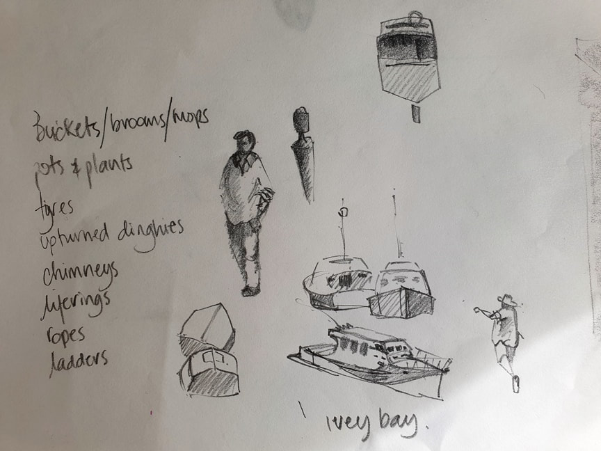
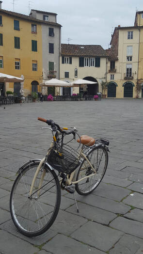
I've been listening to lots of podcasts from artists who love painting en plein air like I do - the interesting thing is, I come from the school of painting what should be there but most of the artists I've been listening to seem very focussed on determining the exact shade of colour (temp and hue) and the exact value of each shape and finding the right scene/subject. I find that to be totally tiresome and tedious, at best, a form of procrastination. When I discover a scene/subject to paint, I can guarantee you I will feel the need, rightly or wrongly, to shift some things around (lamp posts are never in the right place), and change colours and values to suit my idea. I have 2 thoughts about this, firstly, I am NEVER going to find the perfect scene so I might as well get down and dirty right now. Secondly, I am an artist, it's my job to make whatever it is beautiful and meaningful and tell my story through paint. Imagine how many hours I would lose just by simply wandering around looking for the right scene/subject? Most often I have 2-3 hours to paint on location, I better make it snappy. Don't get me wrong I deliberately go to places that I know will please me (crusty, rusty and horrible are the key words here) and I do like it when someone chooses for me and gives me a challenge - its all too easy to fall into the trap of painting the same things over and over. Back to WHAT SHOULD BE THERE. So what should be there? well that's up to you to develop your skills of observation and your sense of good taste and design and what you love. While in Raglan NZ recently, I went to paint the orange dinghy - how disappointing ... i could barely tell it was orange ... back in the day, it positively glowed and reflected into the bay, not only that, the fab building behind it doesn't exist!! My biggest problem is I believe my own press ... I really remember the house being an architectural wonder but I think i painted it that way many years ago and the painting is stuck in my memory!! So I decided to paint the old Dairy Factory behind the nasty building, it's obscured from every vantage point so I'm going to have to make it up, there will be ladders and brooms and mops and buckets, maybe a bloke walking by with a fishing rod. What i really need to consider is how important is the Dairy Factory and if i decide it's very important then i will have to decide what elements I will need to help me communicate "Dairy Factory" without getting naff or kitsch!! The secret message today is, use the scene/subject/photo as your inspiration, not something to be copied faithfully, just because it's there doesn't make it right for a work of art, if they brought back bell bottoms would you wear them? Give your artistic license a whirl!! ciao i miei belli amici!! Amanda Live classes start Feb 8 2022, Auckland New Zealand JOIN UP HERE
2 Comments
Edited from original post April 2018 in Lucca Italy
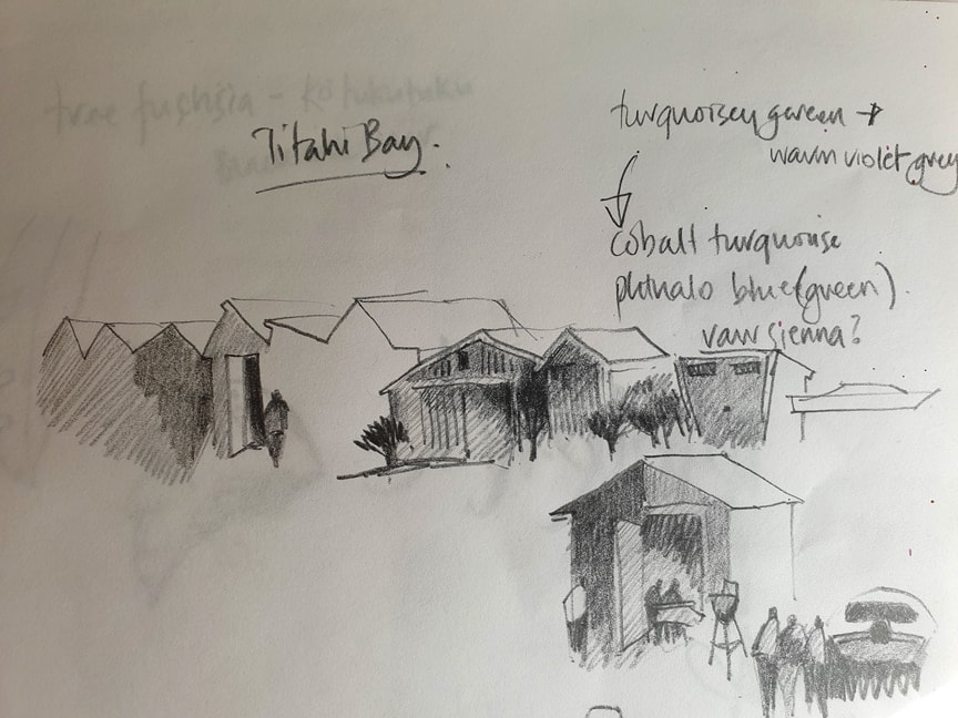
Ciao a tutti!! I'm back in Lucca, my home away from home, preparing for my watercolour painting holiday workshops. This morning I set out to surprise my dear Lucchese friends and while we chat over coffee I became overwhelmed with a huge wave of "I must paint right now!". Not quite organised for plein air painting, a quick value sketch on site will help me understand and remember shapes and values, what I see and prepare me to paint in my studio. My non-so-secret strategy works for any subject, any style and is relevant to design principles from any school of thought. I've mapped out some processes to help you get started on your own plein air sketches. Once I select my subject, I use a soft pencil with a seriously sharp point (I sharpen my pencil several times during my sketching process), I sketch a light "frame" - the size of a credit card - remember this is a value sketch to understand the darks, lights and shapes, you can create a masterpiece sketch later, this small study is purely for the purpose of getting to paint quickly - my key thoughts are:
Sketching AND painting!! Next I lightly mark in a grid of thirds vertically and horizontally, each intersection is an optimal focal area. I'm thinking 5 big shapes with values assigned - no detail at this point - so, for my subject today, my 5 big shapes are:
I used my pencil to measure angles - always have a new pencil on hand, it's hard to measure angles with a stubby!! Now that we have 5 (6) big shapes, first rule of thumb is to forgive yourself for blunders you are about to make, say it out loud "this is the way I want it!!" :) tomorrow you'll do another version and it will be different again because you'll be a different person tomorrow with a different view and a greater skill-set. 2nd rule is to think BIG, Medium, small - in other words VARIETY is the spice of life! 3rd rule is to make INTERESTING shapes - no squares nor circles, odd shapes are best and no shape the same size next to each other, this is more interesting for you as an artist and also for your viewers and collectors - always something new to look at and wonder "why did she do that?" There's a lot to think about and we've barely got started!! mamma mia!! While we're here lets block in a light value tone around white areas just to get our heads in the game. Build up your sketch by giving each shape a darker tone from the shape next to it, it's a good idea to have shapes overlapping so use your eraser to steal back lights/shapes where you need to. Consider leaving "WRONG" marks, don't erase them, they add character - PLUS, I don't know about you, if I erase a wrong mark I can almost guarantee I will make the same wrong mark again!! I think that's why I got to the point of not erasing and I have come to enjoy the marks that make a sketch full of character and life. While I'm sketching I'm positioning darks against lights and lights against darks, especially in the focal area, then I can think about possible detail shapes ... 5 for a small sketch, 7 is stretching it for this size - thinking silhouette shapes only!! To satisfy my itchy fingers I often make a list of goodies to add to my painting later. In this case its pot plants, tables and chairs and people, copper downpipes, chimneys, electrical wiring, pigeons, bicycles, signage etc, etc. I hope you enjoy sketching value studies, with practice you will get better and quicker. I'd love to hear how you get on!! cari amici!! xx
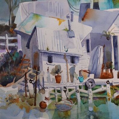
"I keep wanting to get photos of those sheds, but always seems to be wrong time of day, wrong tide or wrong weather for stopping. Or... we use the road on the other side of the estuary!"
This is what happens if you paint photo realism or you are too dependent on photos - you're probably sunk because you are waiting for ideas to happen. Ideas don't just happen - artists, scientists, engineers, poets, musicians MAKE IDEAS HAPPEN. We don't have time to wait. The ugly truth? No matter how long you wait, you will never get your perceived "perfect photo" the weather will be crap, the light will be wrong - whatever! This is really just another form of procrastination. There's 2 solutions:
when you get your horrible photos home, pick out the ones with the stuff you need and start doodling and sketching on a big sheet of paper. make lists. Sketching is an idea generator. ciao cari pittori xx
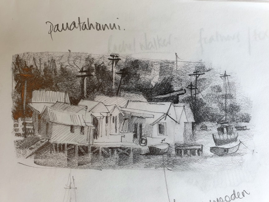
I discovered this scene on a road-trip to Wellington. For a few minutes it had great light, then it was gone. but not only that I couldn't zoom my camera in enough, I'd been driving all day and hadn't found my accommodation yet. no where to sit and soak up the ambiance so a little walk around the bay and a few quick snaps. Photos were terrible but quite a bit of information once I zoomed in.
I've seen many paintings of this scene and thought - wow, how boring - everything straight and lined up - how dull. What can i do to make this more exciting and engaging? I spent quite a lot of time doodling and playing and getting my head in the game! |

AuthorPaintBox Tips, secrets, random thoughts, 
Poetry in watercolour is made in the freedom of the here and now. Amanda Brett Inspiration exists, but it has to find you working - Pablo Picasso 
There are no mistakes in watercolour, just some extra surprises!! Categories
All
What my readers and viewers have to say
Your emails are so informative! I must confess I've watched a couple of your demos from beginning to end, and it makes me want to watercolor!!! I've only ever painted with oil or acrylics and haven't know how to begin with WC. Your content is excellent!
Susan VN Hi Amanda
Thank you for your tips. They inspired me to practise and I realised I haven’t been loading the brush properly. I learnt about adding more paint, and not water, to washes. In today’s tips I like the idea of painting with purpose. Your tips are very helpful. I very much appreciate receiving them. Elizabeth Hi Amanda I enjoyed your post and generous tips. Looked up Dan Burt I begin to see that you can colour any subject to give it pizazz so long as the tone and form is correct Certainly adding value now to my attempts Thanks heaps Annie
Yes very wise words. Agree with not fussing and agree with comments about good quality paint. Well written and inspirational as always. Cheers Janet xxxx Archives
July 2023
Copyright © 2022 All images and text on Amanda's blog and website are the the legal property of Amanda Brett and may not be reproduced without express permission from Amanda Brett or her authorised agent. Thank you for respecting her art and the livelihood of all artists.
|