Watercolour is often viewed as if it occupies its own little vacuum.
I remember a well-known artist friend collecting his paintings after a show: “I’m here to collect my paintings” “What do you mean?” “I’m here to collect my paintings” “Oh you mean your watercolours” As if watercolours are not paintings and are separate, not even a category – not art, nor paintings – urk! However, oddly enough, painted with a brush (in most cases!). It’s a common weird nonsensical bit of claptrap. Mamma mia!! Sometimes it feels like watercolour painters are set up for this. A popular art show I used to enter had a “professional” category for Oils/Acrylics. Does this make me not a professional artist? For a while I entered the professional category just to state my case and annoy them, really it’s just ignorance (mine or theirs??). I was particularly miffed to discover that my well-known watercolour artist Uncle started that show in 1954 (or thereabouts)!! Instead of being hailed the Queen (lol), my bags packed and cast into the snow!! My point is, no matter your medium (pastel, music, poetry, blogging, sculpture, watercolour or oils) art is art and all need the same kind of thought and emotive language – darkness brings the light, grey accentuates chromatic colour, dominance emphasises an accent, indications are mysterious. All art forms follow a set of guidelines (rules to be broken). Visual art is no different, we follow design principles created to help novice (and not-so novice) artists use pictorial or visual language to tell a story via visual impact. In particular, today, I’m talking about colour charging. My 2 ideas for you today are:
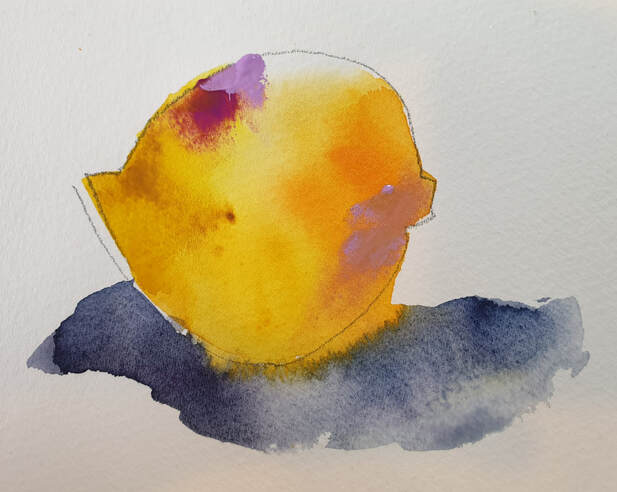
The watercolour painter has to be patient (I’ll just leave now!) and focussed and wait for the water-to-paint-to-brush-to-paper ratio to be just right. Mostly novice watercolour painters are taught to “let it dry” which is the biggest mistake ever. I say this because this damp time is the fun-zone of watercolour and you are missing out my friend! Boo!! Partly the issue lies in our process and planning and partly our lack of brush miles and then sometimes our courage flies out the window. But this FUN-ZONE is where the magic happens, what you and I have to do is be present and pay attention to what we’re doing and what’s happening on the paper. This level of focus is where you’ll learn the poetry of watercolour – choose your focal point and play with it. How fun would it be to paint a lemon with a dab of orange, a bigger dab of a cooler yellow and a master stoke of cool pink for a shadow? ciao belli pitturi!! 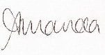
1 Comment
To be truthful, for me, grey is the most frightening colour – I don’t wear grey, I don’t like looking at it, I don’t have it in my house and I HATE grey cloudy days! So when I was told recently that my “greys” were greatly admired I was quite floored, this started a renewed process of investigation, what greys do I create and how do I use them?
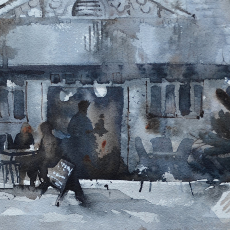
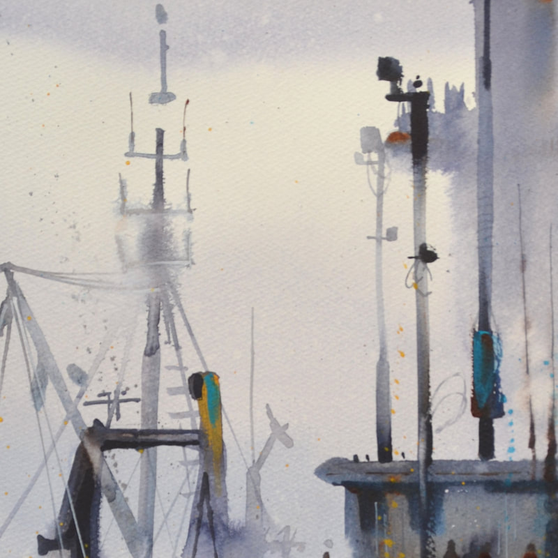
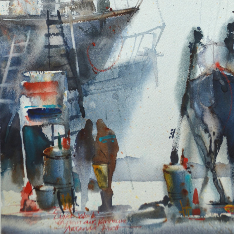
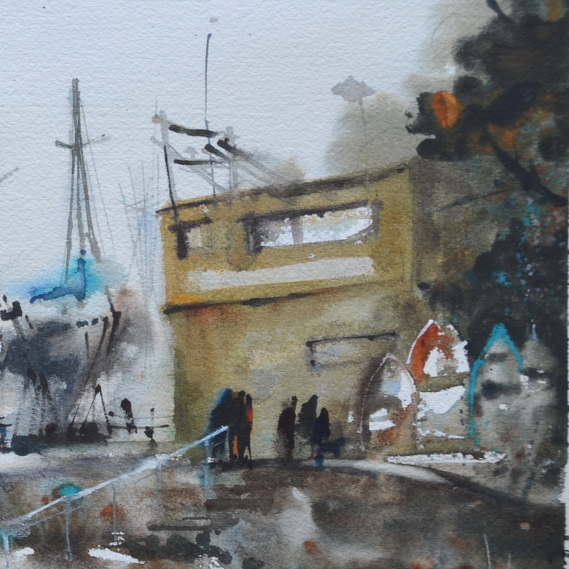
Firstly, good quality watercolours are made from natural minerals (pigments) and due to these natural qualities, react and bounce off each other, quite fun to watch and experiment with. Manufactured blacks and greys are mostly made from a kiln firing process therefore they contain soot - for large washes they can be lifeless and dull and often dry substantially lighter than expected. Secondly, in watercolour, our staples are our complementaries (red vs green, purple vs yellow etc). For example, to neutralise red, I add a little green, a secondary colour containing blue and yellow. When I add green to red I have 3 primaries which means the greying process is started. I paint with tube paints and carefully select transparent watercolours, mostly I use Winsor & Newton pigments and then I add opaque or earth pigments for accents. My favourite palette includes winsor blue (red shade), permanent alizarin crimson and burnt sienna. Sometimes I swap the blue for winsor blue (green) or French ultramarine and alizarin for permanent rose or another transparent “pink” like permanent magenta. I choose this palette because each of these colours have good tinting strength, therefore this palette, with just enough water to mix, will make an exciting and fresh dark and, with diluting, will create fantastic luminous greys. I start by making a violet, for shadow areas a cool violet (ie more blue, less red) and depending on the palette of the day, I may add burnt sienna. For silvery greys try cobalt blue and permanent alizarin for a gorgeous violet then add just a wee touch of raw sienna or try winsor green and permanent alizarin or rose. Cerulean blue or cobalt blue plus burnt sienna, for darker greys try french ultramarine or indigo with burnt sienna. As you can see the sky’s the limit but of course this all depends on the pigments in your palette and what you can do with them – a matter of experimentation. To start with, I mix light value greys in my palette but I make sure I can still see little pockets of the ingredient colours; in other words, sloppy, inefficient colour mixing is best, partly because it ensures there is no accidental overmixing and further, it allows the poetry of watercolour to show. After washing in a light value Grey around whites, I mix a stronger grey with the same pigments but in different ratios so that, for example, I wash a warm grey over a cool grey. I then select one of my accent colours and charge it in and then spatter some of the other colours while it’s still damp. For me watercolour is about poetry, creating beauty and light and life. As Delacroix said 'Colour is the fruit of life' and developing a repertoire of greys will only enhance your colour work. have fun!! ciao Amanda
 Glamping Caviar & Ruffles Glamping Caviar & Ruffles
ny artists, beginners through to professionals are concerned with developing their style, their voice.
One of my personal key concerns is to develop a unique voice - there's a tremendous amount of copying happening, not only that, when groups of people paint together regularly they all seem to paint in the same way. I don't want to paint like the hoards - I want to paint like me, i treasure the unique and the work that it requires. Many years ago, through my local art group I was fortunate to meet a highly skilled and creative artist whose style I quickly fell in love with. I attended his private tuition classes for many years and, although I don't paint exactly in this style, it is an obvious influence. My goal was to paint like me but also include an element of simplicity that is the hallmark of California watercolour. I have had to become very selective about what I see and what I study. I have a level of eidetic memory which can sometimes get in my way - I have to be careful what I look at, I have to keep my end game in my sights at all times. To that end, I don't visit galleries nor do I look at very much art online, I have a few selected books in my artist library. I have no clue who other artists are, I don't care, I'm only interested in creating unique work of my own. Further, the more time I spend away from my easel doing other stuff is too much time away from my easel. But what if you don't know what you want to achieve? How do you find what you like? How do you find something that makes your heart leap? Firstly, I recommend you only study "good" art. Go to Galleries, museums, study the masters, get recommendations from your tutor. Study everything you possibly can, every genre, every style, every artistic movement. At some point, within your practice and your research, you will find something that really speaks to you. Learn to critique, what do you like, not like. Once you find it, put everything else aside and focus all your efforts onto your discovery. A well known watercolour painter friend suggests that learning to paint is a 25 year apprenticeship, you might feel you are behind the 8-ball . However you might also find that, if you are an older artist, you have clearer ideas about colours and styles, and know the subjects you love already, its really about how to communicate those ideas in a way that pleases you - practice, practice, practice!! repeat, repeat, repeat!! what's your thinking on this? what have you discovered about yourself? ciao |
AuthorPaintBox Tips, secrets, random thoughts, 
Poetry in watercolour is made in the freedom of the here and now. Amanda Brett Inspiration exists, but it has to find you working - Pablo Picasso 
There are no mistakes in watercolour, just some extra surprises!! Categories
All
What my readers and viewers have to say
Your emails are so informative! I must confess I've watched a couple of your demos from beginning to end, and it makes me want to watercolor!!! I've only ever painted with oil or acrylics and haven't know how to begin with WC. Your content is excellent!
Susan VN Hi Amanda
Thank you for your tips. They inspired me to practise and I realised I haven’t been loading the brush properly. I learnt about adding more paint, and not water, to washes. In today’s tips I like the idea of painting with purpose. Your tips are very helpful. I very much appreciate receiving them. Elizabeth Hi Amanda I enjoyed your post and generous tips. Looked up Dan Burt I begin to see that you can colour any subject to give it pizazz so long as the tone and form is correct Certainly adding value now to my attempts Thanks heaps Annie
Yes very wise words. Agree with not fussing and agree with comments about good quality paint. Well written and inspirational as always. Cheers Janet xxxx Archives
July 2023
Copyright © 2022 All images and text on Amanda's blog and website are the the legal property of Amanda Brett and may not be reproduced without express permission from Amanda Brett or her authorised agent. Thank you for respecting her art and the livelihood of all artists.
|