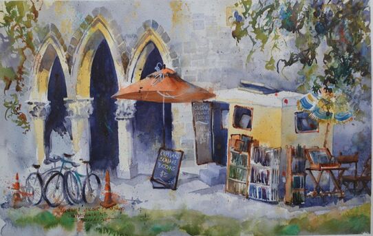
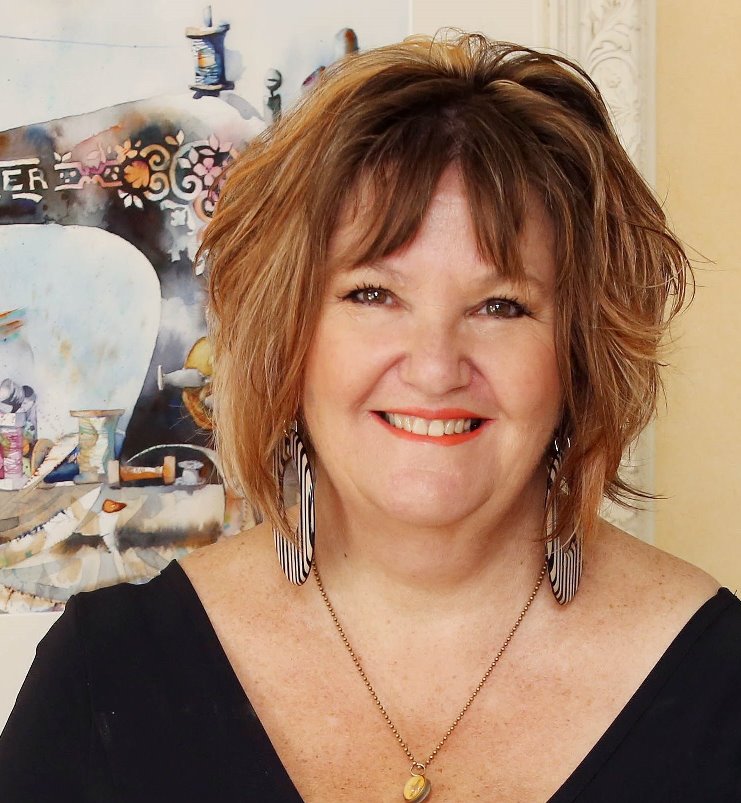
 Custard Square Bookshop, Christchurch, New Zealand Custard Square Bookshop, Christchurch, New Zealand
Jude asked:
Do you always plan out everything ie... colours for everything and where bikes, cones etc might go? Yes I do plan everything out BUT as I'm a little haphazard (read Arty-Farty - aka rip sh*t and bust!) I'm also happy to let go and see where the "unplan" takes me. So sometimes my painting is not like my sketch (sometimes my sketches are not like the scene!!). You know that I pretty much always map out my design in a thumbnail sketch first. This sketch is about studying the pattern of the light and the dark and working out a composition. It's not about detail. I'm working out how I can use them to move the viewers eye around the painting. this sketch also helps me to learn about the scene/subject, it helps me to discover areas that could become a problem, or elements that I can take advantage of eg interlocking and overlapping shapes. I make a "shopping list" of elements in the scene that I may or may not want to add into my painting and choose the ones that I like or help me to tell my story. Once I've drawn my map onto my watercolour paper, I sometimes find there are areas that could be utilised or need a little filling up, these ideas come from my shopping list. with regard to palette selection, I'm often smitten with a particular palette for a year or two and then replace a pigment or two. I usually use the same foundation palette for my realism work, based on transparent primary pigments, just the three plus burnt sienna, the same three I recommend to beginners. These colours will mix into every colour you could possibly need - just as well if you're in lockdown and no art supply store!! Divertiti tutti!! 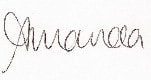
0 Comments
Watercolour is often viewed as if it occupies its own little vacuum.
I remember a well-known artist friend collecting his paintings after a show: “I’m here to collect my paintings” “What do you mean?” “I’m here to collect my paintings” “Oh you mean your watercolours” As if watercolours are not paintings and are separate, not even a category – not art, nor paintings – urk! However, oddly enough, painted with a brush (in most cases!). It’s a common weird nonsensical bit of claptrap. Mamma mia!! Sometimes it feels like watercolour painters are set up for this. A popular art show I used to enter had a “professional” category for Oils/Acrylics. Does this make me not a professional artist? For a while I entered the professional category just to state my case and annoy them, really it’s just ignorance (mine or theirs??). I was particularly miffed to discover that my well-known watercolour artist Uncle started that show in 1954 (or thereabouts)!! Instead of being hailed the Queen (lol), my bags packed and cast into the snow!! My point is, no matter your medium (pastel, music, poetry, blogging, sculpture, watercolour or oils) art is art and all need the same kind of thought and emotive language – darkness brings the light, grey accentuates chromatic colour, dominance emphasises an accent, indications are mysterious. All art forms follow a set of guidelines (rules to be broken). Visual art is no different, we follow design principles created to help novice (and not-so novice) artists use pictorial or visual language to tell a story via visual impact. In particular, today, I’m talking about colour charging. My 2 ideas for you today are:
The watercolour painter has to be patient (I’ll just leave now!) and focussed and wait for the water-to-paint-to-brush-to-paper ratio to be just right. Mostly novice watercolour painters are taught to “let it dry” which is the biggest mistake ever. I say this because this damp time is the fun-zone of watercolour and you are missing out my friend! Boo!! Partly the issue lies in our process and planning and partly our lack of brush miles and then sometimes our courage flies out the window. But this FUN-ZONE is where the magic happens, what you and I have to do is be present and pay attention to what we’re doing and what’s happening on the paper. This level of focus is where you’ll learn the poetry of watercolour – choose your focal point and play with it. How fun would it be to paint a lemon with a dab of orange, a bigger dab of a cooler yellow and a master stoke of cool pink for a shadow? ciao belli pitturi!!
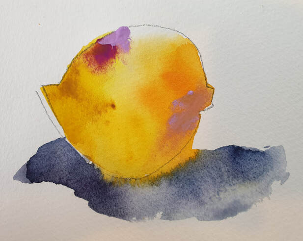
 Harum Scarum, WNZ demo painting July 2021. 5th painting in my Pauatahanui series Harum Scarum, WNZ demo painting July 2021. 5th painting in my Pauatahanui series
My workshops on how to generate design ideas came about because a student said they were not ever able to get a “good” photograph of the scene.
I worked very hard on the design of “pauatahanui” and the ensuing series because it’s a popular scene to paint. So how could I make mine different? I got all excited and had to see these boat sheds for myself (aka ROAD TRIP!!). It took 6 months to create a design concept I was happy with. So the subject of this workshop became how to design a painting and not be reliant on good photos because good photos are rare and don't miraculously turn up when required! Somewhat akin to how to paint from a bad photo. Another thought, it doesn't take courage to paint what you see - it does take courage to paint what you think and feel. I often turn away from my reference, it was pointed out to me some years ago that I rarely “look” at my subject. Through my study and observation I begin a path of understanding. I take reference photos, I create thumbnail studies which lead me to my design idea - I want my work to be unique, I want the essence of the subject, I want it to be from me. So, how to be less reliant on photos? it's all about getting an idea. one thing I must say to you is that, generating ideas is not easy, like everything it takes consistent and frequent effort. My typical practice revolves around drawing/designing (en plein air or in my studio) a thumbnail and doodling some of the shapes I think I will want. What do I like or not like? Leave out, add in, bring something relevant in from another scene. This is where I get to know my subject and the relationships of the other elements to each other. I have sketched/painted many boat yard scenes so I feel confident about bringing ideas in from previous study. And that's what this is about - study and observation. Even though I have no intention of creating a photographic realism painting, I need to understand shapes, light and dark, perspective, values etc to create a work based on simplified shapes. what could i do that was different/better? Firstly, I have the power of watercolour's fluidity; secondly, a unique composition. So the idea became the jumble and chaos of boatsheds and the ensuing detritus. ciao Amanda |
AuthorPaintBox Tips, secrets, random thoughts, 
Poetry in watercolour is made in the freedom of the here and now. Amanda Brett Inspiration exists, but it has to find you working - Pablo Picasso 
There are no mistakes in watercolour, just some extra surprises!! Categories
All
What my readers and viewers have to say
Your emails are so informative! I must confess I've watched a couple of your demos from beginning to end, and it makes me want to watercolor!!! I've only ever painted with oil or acrylics and haven't know how to begin with WC. Your content is excellent!
Susan VN Hi Amanda
Thank you for your tips. They inspired me to practise and I realised I haven’t been loading the brush properly. I learnt about adding more paint, and not water, to washes. In today’s tips I like the idea of painting with purpose. Your tips are very helpful. I very much appreciate receiving them. Elizabeth Hi Amanda I enjoyed your post and generous tips. Looked up Dan Burt I begin to see that you can colour any subject to give it pizazz so long as the tone and form is correct Certainly adding value now to my attempts Thanks heaps Annie
Yes very wise words. Agree with not fussing and agree with comments about good quality paint. Well written and inspirational as always. Cheers Janet xxxx Archives
July 2023
Copyright © 2022 All images and text on Amanda's blog and website are the the legal property of Amanda Brett and may not be reproduced without express permission from Amanda Brett or her authorised agent. Thank you for respecting her art and the livelihood of all artists.
|